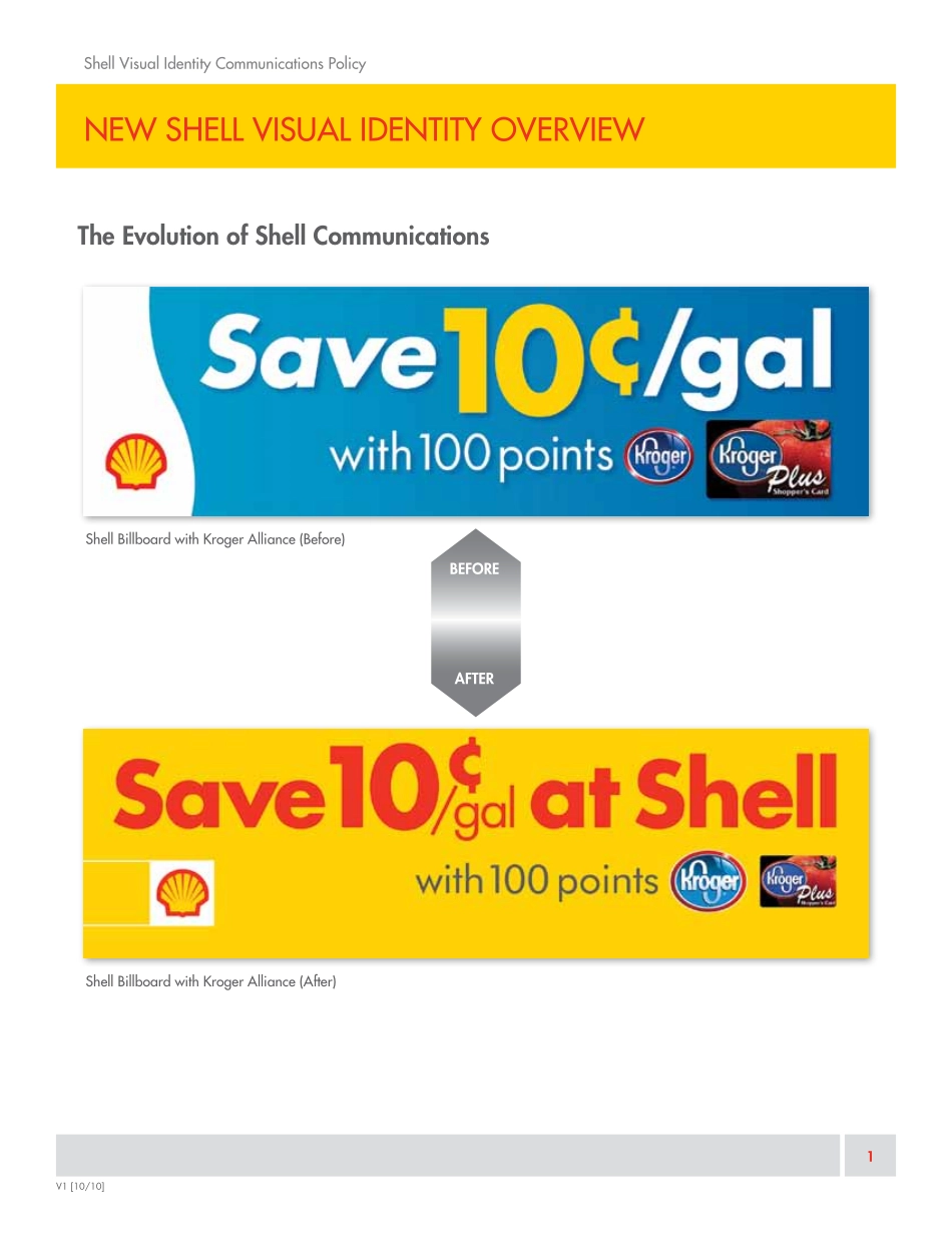
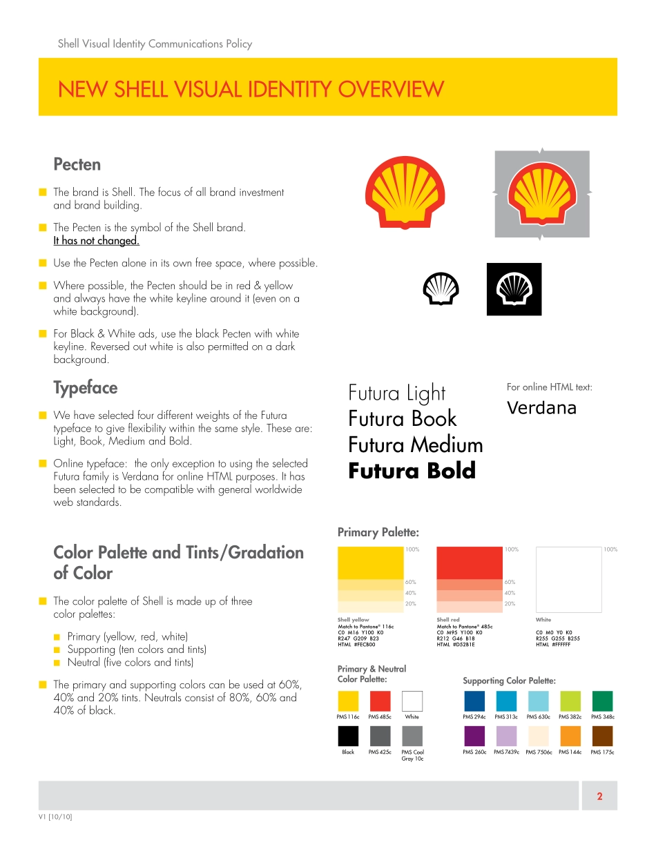
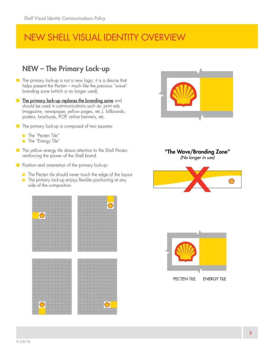
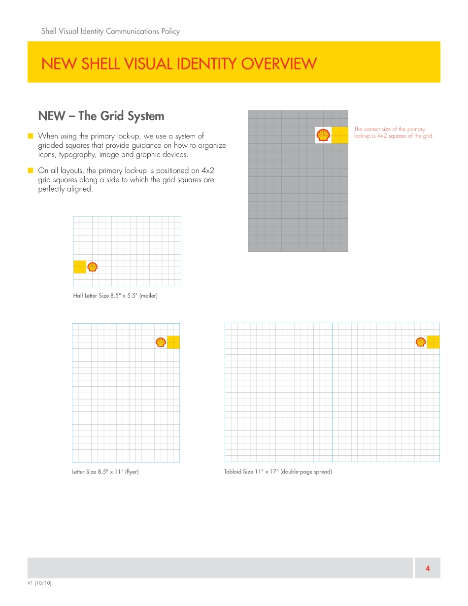
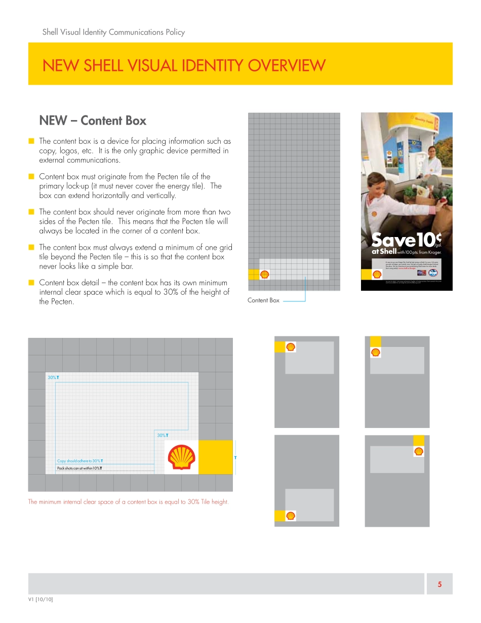
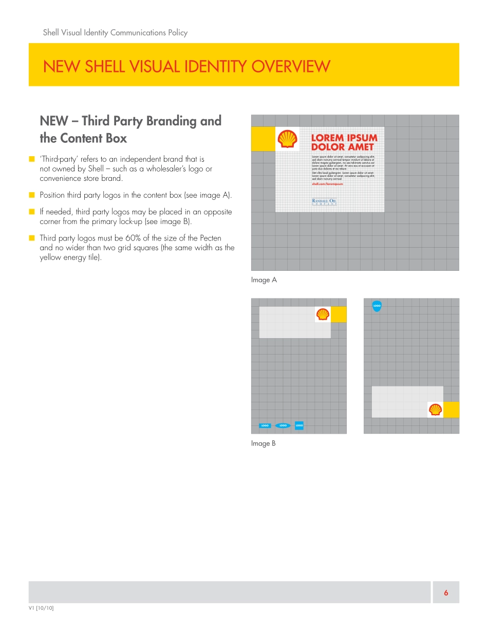
SHELL VISUAL IDENTITYThe Basic Elements of the New Shell Visual Identity ExplainedOCTOBER 2010AN INTroducTIoN from ThE gm, mArkETINg, NorTh AmErIcAShell Visual Identity communications Policy | IntroductionShell Wholesalers, As you know, the Shell brand is a force in the industry, and your commitment to the brand has been a key lever to our combined success for many years. The brand is an expression of who we are collectively and what we stand for. And the Shell Pecten, in particular, has become the symbol of our culture of innovation and leadership. Beginning January 2011, the Shell Visual Identity, or how our brand is projected in all communications will evolve to better communicate messages more clearly. The purpose of these changes is to improve the consistency and coherence across all Shell communications – making them look like they come from the same company. By using this policy, together we will drive the effectiveness of our communications.A summary of the factors of the new Visual Identity includes:• the Pecten is the symbol of the brand and has not changed;• primary color palette remains (red, yellow, white) with a simplified supporting color selection;• introduction of the “Primary Lock-up,” replacing the “Wave” or “Branding Zone”This brochure will provide you and your staff with an overview of the key elements of the new Shell Visual Identity. I ask that you review these details and adopt the new guidelines in your locally-developed advertisements and point-of-purchase creative beginning in January 2011. Please do not hesitate to ask for support if needed.As ambassadors of the brand and the face of Shell in your communities, we will continue to build the Shell brand in the US together. Thank you in advance for adopting these guidelines in your communications to consumers.Sincerely,David BunchGeneral ManagerMarketing, North America“The purpose of these changes is to improve the consistency and coherence across all Shell communications — making them look like they come from the same company. By using this policy, together we will drive the effectiveness of our communications.”V1 [10/10]new shell visual identity overviewshell visual identity Communications Policy1V1 [10/10]The Evolution of Shell Communicationsshell Billboard with Kroger alliance (Before)shell Billboard with Kroger alliance (after)AFTERBEFOREnew shell visual identity overviewshell visual identity Communications Policy2V1 [10/10]2Pecten■ The brand is Shell. The focus of all brand investment and brand building.■ The Pecten is the symbol of the Shell brand. it has not changed.■ Use the Pecten alone in its own free space, where possible.■ Where possible, the Pecten should be in red & yellow and always have the white keyline around it (even on a white background).■ For Black & White ads, use the black Pecten with white keyline. Reversed out white is...