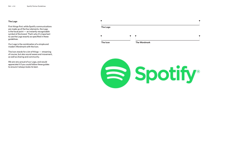
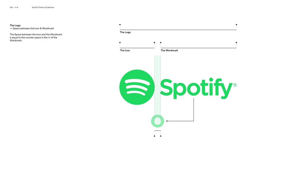
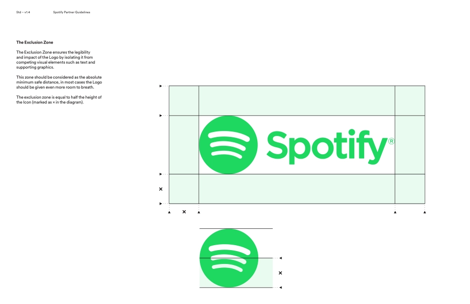
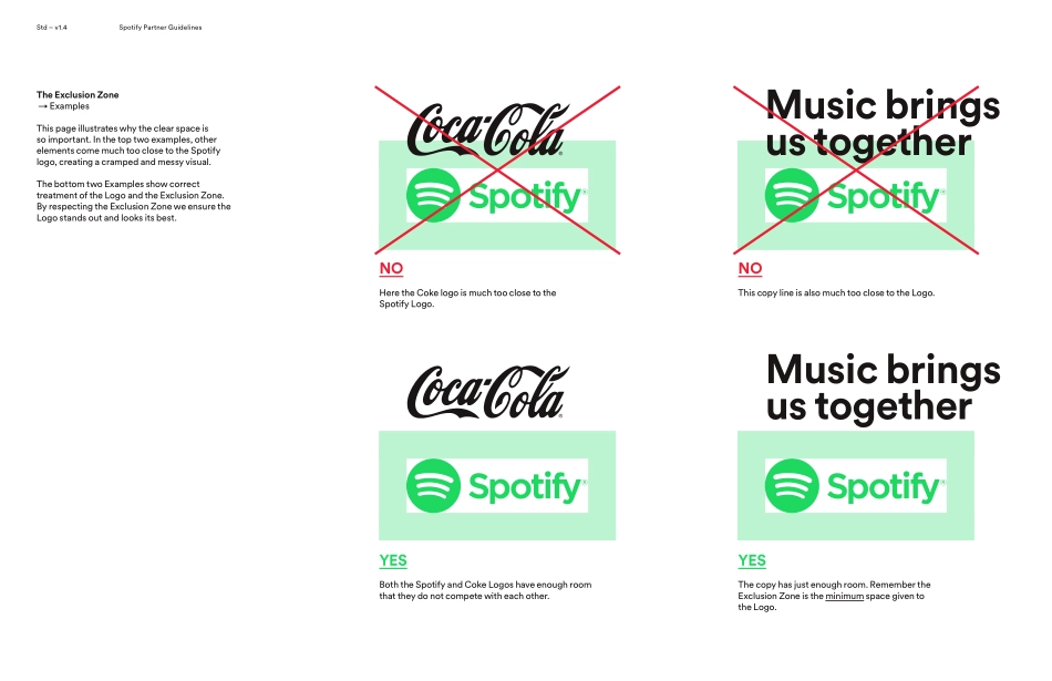
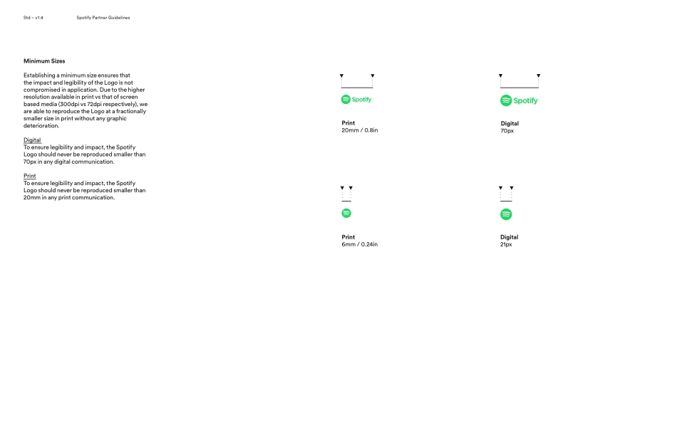
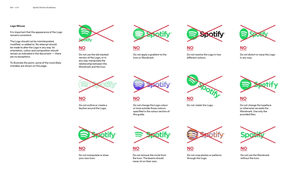
The LogoStd – v1.4Spotify Partner Guidelines Std – v1.4Spotify Partner Guidelines The WordmarkThe LogoThe IconThe LogoFirst things first; while Spotify communications are made up of the four elements, the Logo is the focal point — an instantly recognisable symbol of the brand. That’s why it’s important to use the Logo exactly as specified in these guidelines. Our Logo is the combination of a simple and modern Wordmark with the Icon.The Icon stands for a lot of things — streaming of course, but also sound waves and movement, as well as sharing and community. We are very proud of our Logo, and would appreciate it if you could follow these guides to ensure it always looks its best.Std – v1.4Spotify Partner Guidelines The WordmarkThe LogoThe IconThe Logo→ Space between the Icon & WordmarkThe Space between the Icon and the Wordmark is equal to the counter space in the ‘o’ of the Wordmark.Std – v1.4Spotify Partner Guidelines ××The Exclusion Zone The Exclusion Zone ensures the legibility and impact of the Logo by isolating it from competing visual elements such as text and supporting graphics. This zone should be considered as the absolute minimum safe distance, in most cases the Logo should be given even more room to breath.The exclusion zone is equal to half the height of the Icon (marked as × in the diagram).×Std – v1.4Spotify Partner Guidelines Music brings us togetherThe Exclusion Zone → ExamplesThis page illustrates why the clear space is so important. In the top two examples, other elements come much too close to the Spotify logo, creating a cramped and messy visual. The bottom two Examples show correct treatment of the Logo and the Exclusion Zone. By respecting the Exclusion Zone we ensure the Logo stands out and looks its best.Music brings us togetherNOHere the Coke logo is much too close to the Spotify Logo.YESBoth the Spotify and Coke Logos have enough room that they do not compete with each other.NOThis copy line is also much too close to the Logo.YESThe copy has just enough room. Remember the Exclusion Zone is the minimum space given to the Logo. Std – v1.4Spotify Partner Guidelines The IconUnder certain circumstances we prefer to simply use the Icon on its own instead of the full Logo mark. In general, these are communications where the Spotify brand has already been established, either through use of the full logo, in copy, or by voiceover. Alternatively, there will be situations in which we will want the Spotify brand to appear more recessive, such as on T-Shirts, other merchandise, or environmental graphics like a wall mural. In these instances, we want the graphics to be the main element and the Icon to act as a subtle sign off.NoteWhile the Icon can exist without the Wordmark, the Wordmark should never exist without the Icon. The IconStd – v1.4Spotify Partner Guidelines The...