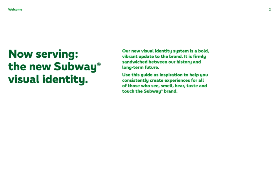
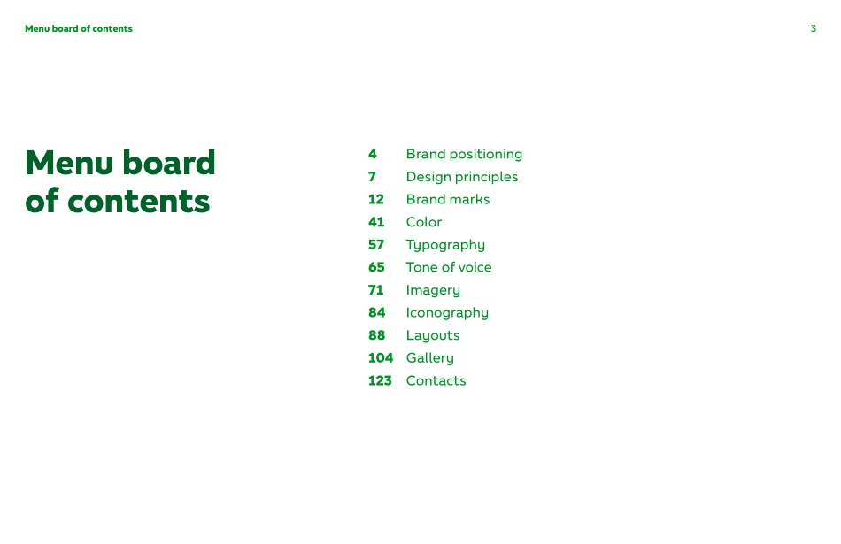
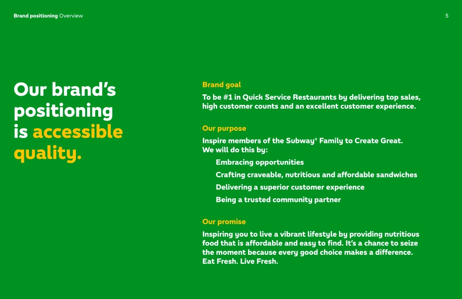
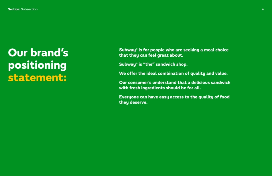
Subway® Brand Guidelines Version 1.02WelcomeNow serving: the new Subway® visual identity.Our new visual identity system is a bold, vibrant update to the brand. It is firmly sandwiched between our history and long-term future. Use this guide as inspiration to help you consistently create experiences for all of those who see, smell, hear, taste and touch the Subway® brand. 3Menu board of contentsMenu board of contents4 Brand positioning7 Design principles12 Brand marks41 Color57 Typography65 Tone of voice71 Imagery84 Iconography88 Layouts104 Gallery123 ContactsBrand positioning5Brand positioning OverviewBrand goalTo be #1 in Quick Service Restaurants by delivering top sales, high customer counts and an excellent customer experience. Our purposeInspire members of the Subway® Family to Create Great. We will do this by: Embracing opportunities Crafting craveable, nutritious and affordable sandwiches Delivering a superior customer experience Being a trusted community partnerOur promiseInspiring you to live a vibrant lifestyle by providing nutritious food that is affordable and easy to find. It’s a chance to seize the moment because every good choice makes a difference. Eat Fresh. Live Fresh. Our brand’s positioning is accessible quality.Section: Subsection6Subway® is for people who are seeking a meal choice that they can feel great about.Subway® is “the” sandwich shop.We offer the ideal combination of quality and value.Our consumer’s understand that a delicious sandwich with fresh ingredients should be for all.Everyone can have easy access to the quality of food they deserve.Our brand’s positioning statement:Design principles8Design principlesOur design principles help to maintain a connection to the brand positioning and guide our artistry. 9Design principlesLimitless vitalityEvery interaction with the Subway® brand is an opportunity for nourishment—both physical and mental. We use a tasty approach to color—delicious imagery that tells a story and a bold, sweet new use of our logotype and brand marks. 10Progressive balanceYellow and/or green, healthy and/or indulgent, this way and/or that—we always find new ways to strike the perfect balance and cater to our guests so that they can do the same.Design principlesPurposeful craftSubway® Sandwich Artists™ and our guests make carefully considered choices when creating the best subs possible. We do the same with our visual identity—crafting all of our assets with the utmost care and penning equally thoughtful messaging.Design principles11Brand marks13Brand marks LogotypeLooking back so we can move forwardCarefully crafted, the groovy letterforms of the ’60s have been made more modern and confident. The Subway® arrows pull us from the past and move us into the future. Our logotype is the clearest designation of the brand and should be found in all key creative work—including our restaurant signage, ...