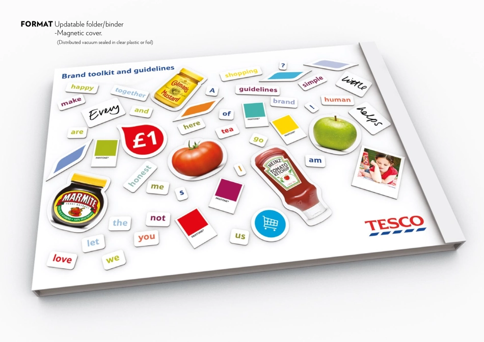
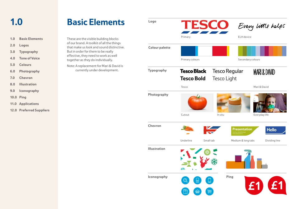
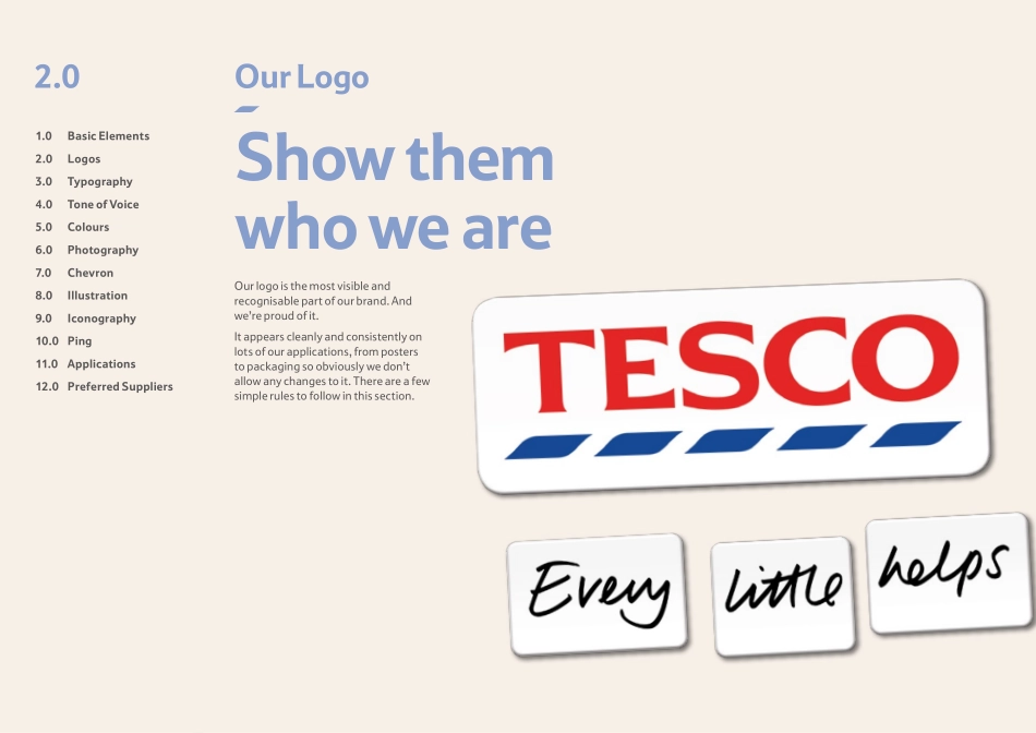
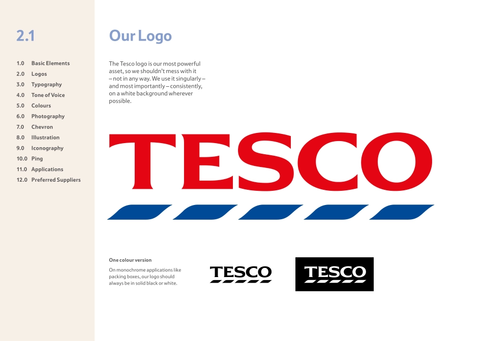
The Clearing12th JuLY 2013TesCo one voiCe guidelineFormaT updatable folder/binder - Magnetic cover. (Distributed vacuum sealed in clear plastic or foil)FormaT updatable folder/binder - Magnetic cover. (Distributed vacuum sealed in clear plastic or foil)Brand toolkit and guidelines1.0 Basic Elements2.0 Logos3.0 Typography4.0 Tone of Voice5.0 Colours6.0 Photography7.0 Chevron8.0 Illustration9.0 Iconography10.0 Ping11.0 Applications12.0 Preferred SuppliersHelloIf you’re reading this, you’re one of the team helping to bring the Tesco brand to life. Welcome on board.As we continue to evolve as a business, it’s more important than ever to look and sound like one Tesco. Wherever and whenever anyone comes into contact with us, we want their experience to be consistent. And getting that right starts with each and every one of us.So take good care of our brand, help people fall in love with it just like we have and - most importantly - make sure you have some fun along the way.1.0 Basic Elements2.0 Logos3.0 Typography4.0 Tone of Voice5.0 Colours6.0 Photography7.0 Chevron8.0 Illustration9.0 Iconography10.0 Ping11.0 Applications12.0 Preferred SuppliersBasic Elements1.0Tesco BlackTesco BoldTesco RegularTesco LightMari & DAvidLogoPrimaryPrimary coloursTescoMari & DavidELH deviceSecondary coloursCutoutUnderlineSmall tabMedium & long tabsDividing lineIn situEveryday lifeColour paletteTypographyPhotographyChevronIllustrationIconographyPingPresentationSub line should be keptshort and succinct.RPresentationSub line should be keptshort and succinct.PresentationSub line should be keptshort and succinct.RePresentationSub line should be keptshort and succinct.RecycleThese are the visible building blocks of our brand. A toolkit of all the things that make us look and sound distinctive. But in order for them to be really effective, they need to work as well together as they do individually.Note: A replacement for Mari & David is currently under development.1.0 Basic Elements2.0 Logos3.0 Typography4.0 Tone of Voice5.0 Colours6.0 Photography7.0 Chevron8.0 Illustration9.0 Iconography10.0 Ping11.0 Applications12.0 Preferred SuppliersOur LogoShow them who we are2.0Our logo is the most visible and recognisable part of our brand. And we’re proud of it. It appears cleanly and consistently on lots of our applications, from posters to packaging so obviously we don’t allow any changes to it. There are a few simple rules to follow in this section.1.0 Basic Elements2.0 Logos3.0 Typography4.0 Tone of Voice5.0 Colours6.0 Photography7.0 Chevron8.0 Illustration9.0 Iconography10.0 Ping11.0 Applications12.0 Preferred SuppliersOur Logo2.1The Tesco logo is our most powerful asset, so we shouldn’t mess with it – not in any way. We use it singularly – and most importantly – consistently, on a white background wherever possible. One colour versionOn monochrome applications like packing boxes, our logo should always be in...