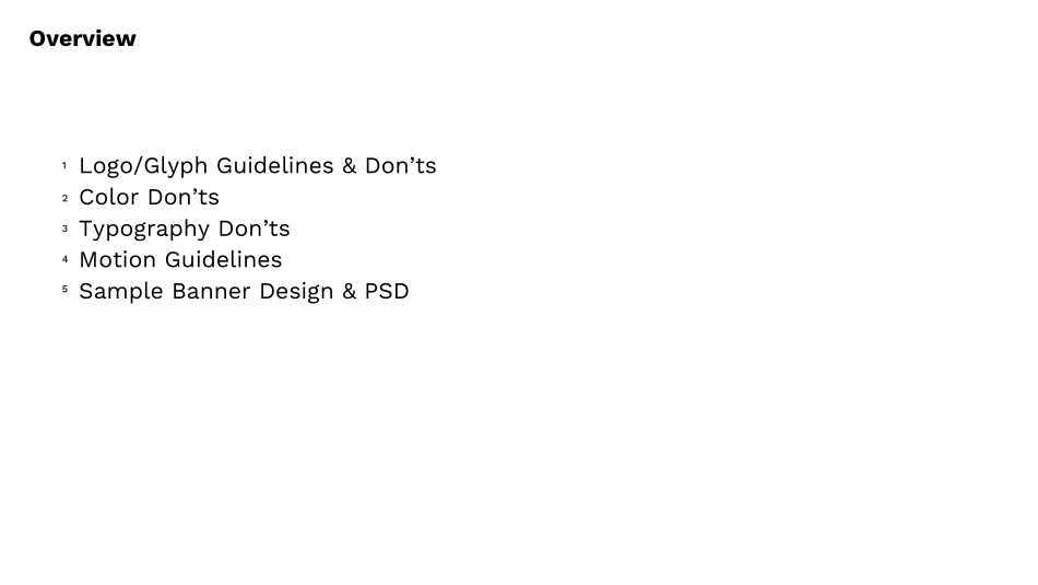
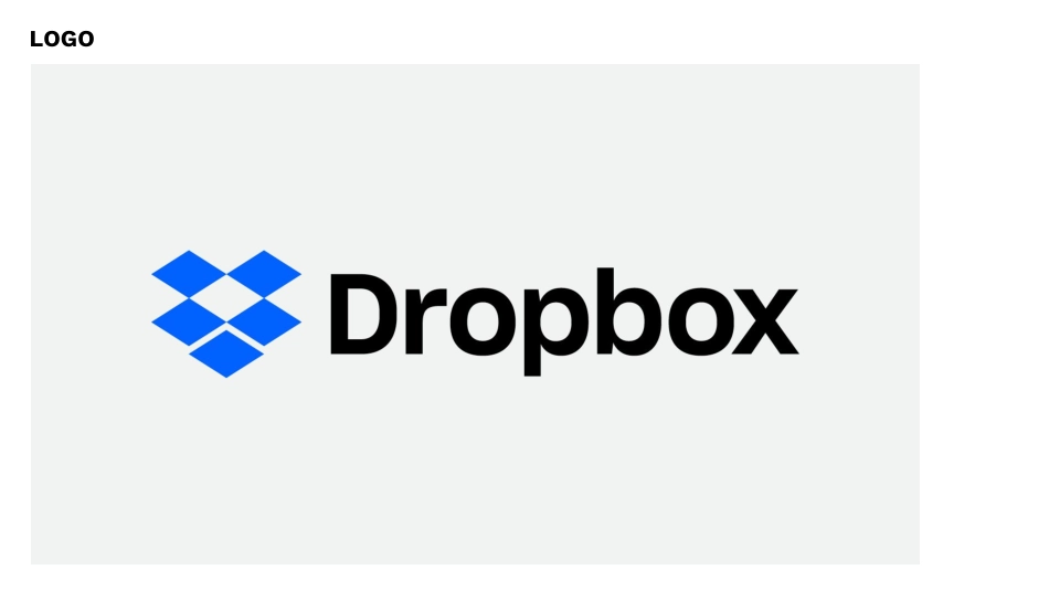
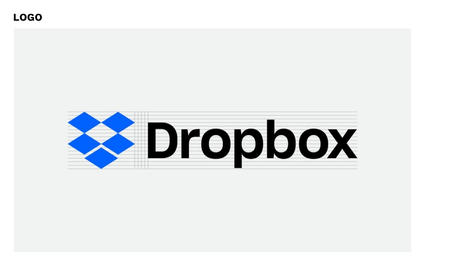
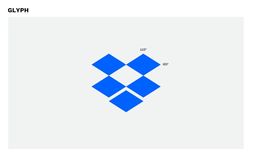
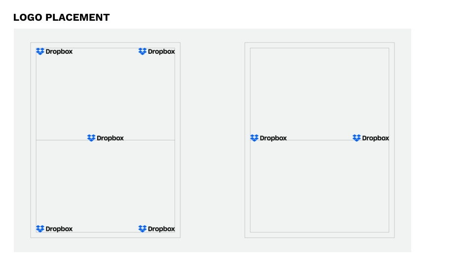
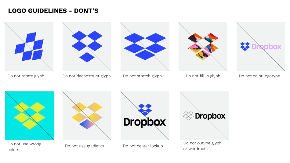
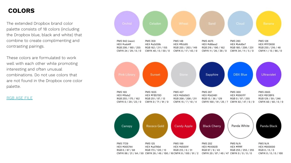
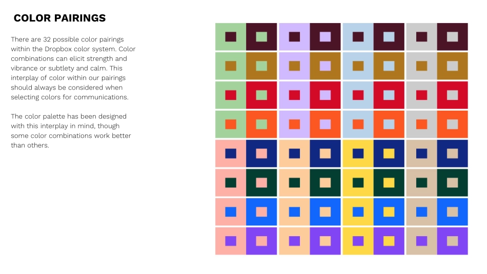
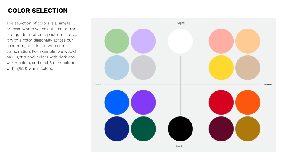
Dropbox BrandGuidelinesAugust 26, 2017Logo/Glyph Guidelines & Don’tsColor Don’tsTypography Don’tsMotion GuidelinesSample Banner Design & PSD123Overview45LOGOLOGOGLYPH LOGO PLACEMENTLOGO GUIDELINES - DONT’SDo not rotate glyphDo not deconstruct glyphDo not stretch glyphDo not fill in glyphDo not use wrong colorsDo not use gradientsDo not center lockupDo not outline glyph or wordmarkDo not color logotypeCOLORSThe extended Dropbox brand color palette consists of 18 colors (including the Dropbox blue, black and white) that combine to create complimenting and contrasting pairings.These colors are formulated to work well with each other while promoting interesting and often unusual combinations. Do not use colors that are not found in the Dropbox core color palette.RGB ASE FILEThere are 32 possible color pairings within the Dropbox color system. Color combinations can elicit strength and vibrance or subtlety and calm. This interplay of color within our pairings should always be considered when selecting colors for communications.The color palette has been designed with this interplay in mind, though some color combinations work better than others.COLOR PAIRINGSThe selection of colors is a simple process where we select a color from one quadrant of our spectrum and pair it with a color diagonally across our spectrum, creating a two-color combination. For example, we would pair light & cool colors with dark and warm colors, and cool & dark colors with light & warm colors. COLOR SELECTIONHere are a few examples on how the colors can be paired.COLOR PAIRING EXAMPLESCOLOR DONT’SDo not use gradientsDo not use non brand colorsDo not use color effectsDo not use black as a background with brand colorsDo not use black on dark colorsDo not use high contrast colorsDo not use one color for logo and glyphDo not use white glyph with colored wordmarkDo not use non system color pairingsDo not use DBX blue with non-system colorsSharp Grotesk is the primary brand typeface for Dropbox.It is used for all display text and information for all communications.The majority of our company communications, across campaigns and websites, will only use three primary weights of Sharp: Book 22, Medium 22, and Semibold 22 in roman.TYPEFACEAlignment and RagParagraphs are always set flush left with a ragged right. The left edge of the paragraph is always straight, the right edge is always ragged. Paragraphs are never centered.ScaleOur headline type should be large and bold. Please try to keep copy short and to the point as this allows the use of larger point sizes for more visual impact. A large difference between the headline and text copy should be readily apparent.HyphenationHeadlines should never be hyphenated.CaseBody copy is always set sentence case (upper and lowercase). Never set body copy in all caps or all lowercase.TYPOGRAPHYINCORRECT TYPE USAGEMOTION GUIDELINESPlane PrinciplesPlanes can affect change on contentPlanes can push/pull each otherPlanes can reveal/hide new contentMOTION GUIDELINES - PLANES DONT’SDo not use planes on an angleDo not use too many planesDo not use multiple background colorsMOTION GUIDELINESPlane Grid & Isometric Perspective Glyphs are constructed from planes that occupy a grid, which is being viewed from an isometric perspective.Plane movement on the grid should be single axis - Single Axis Movement — ScaleWe will need a device for hiding & revealing planes on the screen. Scaling the planes is a simple way to do that, but should not be combined with any other types of movement.MOTION GUIDELINESSingle Axis Movement — X or YOnce a plane is on the screen, it’s movement should only take place on one axis at a time, preferably only the X or Y. Adding some squash & stretch to plane gives the animation some extra energy & character. Single Axis Movement — ZSince certain glyphs have planes that occupy multiple Z-Depths, planes can sometimes move along the Z axis.SAMPLE BANNER: Type and Plane onlySAMPLE PSD LINKSAMPLE BANNER: With Images / Co-CreationStatic Banners | Campaign Awareness300x250Option 01Equal MarginsHeadline: Sharp Grotesk Medium 22 - 15 pt type size / 15 pt leadingSublines: Sharp Grotesk Medium 22 - 7.5 pt type size (half of headline)1½ Campaign Messaging OverviewThe world needs your creative energyLet’s Keep It FlowingONE OVERARCHING MESSAGE[LOGO] + Dropbox运营动脉关于我们ABOUT US WWW.YYDM.CN运营动脉是一个精心管理了4年的运营资料库,目前拥有超过60000+ 份运营资料,1000+运营渠道合作资源。当你在日常工作中,可以用它快速搜方案、看案例、读报告、做课件、找模板、下素材、用工具、学课程等。90%常见的运营需求都可找到模板和案例,工作中即可拿来直接套用,提高我们的工作效率,资料库持续更新ing…运营动脉官方服务号运营资料铺官方公众号运营动脉官方网站运营动脉APP下载业务联系站长微信