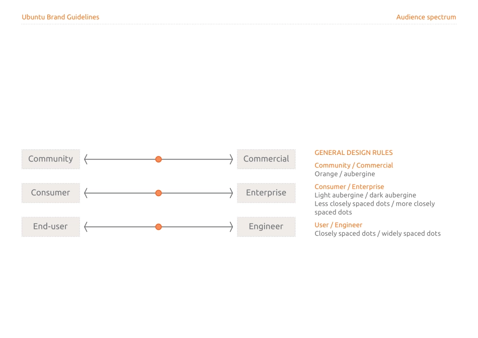
Brand GuidelinesUbuntu Brand Guidelines IntroductionWe believe that everyone has the right to a high-quality computing experience. And we believe it should be free. Ubuntu is the best operating system in the world. It’s fast, free and safe. More than an operating system, Ubuntu is at the forefront of a world-changing revolution that’s gathering pace every day. A truly collaborative eff ort with freedom at its heart, Ubuntu is the result of a growing community working together to produce something extraordinary.Our valuesUbuntu Brand Guidelines IntroductionA successful visual identity has to be consistent, recognisable and powerful.The following guidelines should help all of us to create a distinct, professional visual identity that clearly communicates our brand values.Please take some time to understand how to apply these guidelines correctly.Why do we need guidelines?Ubuntu Brand Guidelines Ubuntu core valuesUbuntu embodies freedom, and is collaborative, precise and reliable.Our valuesUbuntu Brand Guidelines BrandmarksThe brandmark is the most recognisable feature of any brand identity. Our new brandmarks represent our core values.Our brandmarksUbuntu Brand Guidelines BrandmarksTHE UBUNTU BRANDMARKUbuntu has grown up. We’ve revisited the circle-of-friends idea and evolved it. Our new Ubuntu brandmark has two parts: the word mark and the symbol.The word mark - We’ve designed a new font, which harnesses the core values of precision and reliability in particular. Given that the theme for the next fi ve years is light, the preferred use of the word mark is white typography on a fl at orange-coloured background.The symbol - The new symbol simplifi es and sharpens the original circle-of-friends design. It’s leaner, more refi ned and more contemporary. Wherever possible, the symbol should always appear as white on a fl at orange-coloured background.THE CANONICAL LOGOThe new Canonical brandmark is smart, precise and focused. It is clearly linked to Ubuntu but equally clearly diff erentiated.The word mark - The Canonical word mark adopts the same font as the Ubuntu word mark, but uses capital letters. The preferred use of the word mark is white typography on a fl at aubergine-coloured background.The symbol - The new symbol plays on the ideas of Canonical being focused and targeted. These ideas strongly relate to our core values of reliability, precision and adroitness. Similar to Ubuntu, the symbol should always appear as white on a fl at aubergine-coloured background wherever possible.Ubuntu Brand Guidelines Ubuntu and CanonicalUBUNTU AND CANONICALA strong, purposeful and vibrant identity for Ubuntu and Canonical are central to our success. In the past, the distinctive look of Ubuntu lent itself well to pure community messaging, but it was hard to use the same approach for Canonical’s commercial services. We needed to move away from a one-size...
