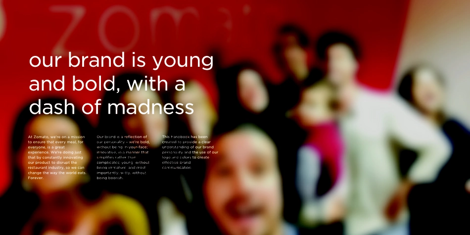
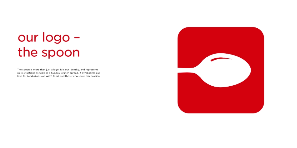
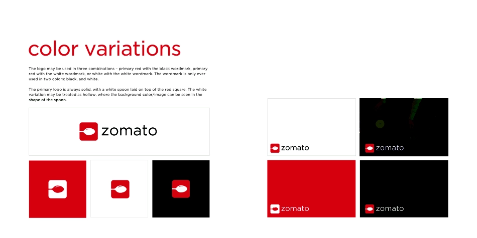
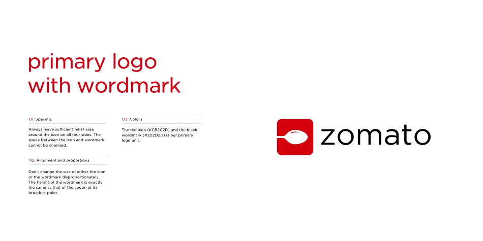
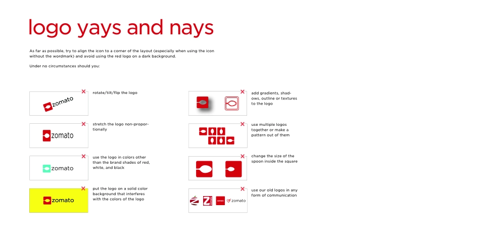
brand guidelinestable of contents01 BRAND02 LOGOS AND UNITS03 COLORSAt Zomato, we're on a mission to ensure that every meal, for everyone, is a great experience. We're doing just that by constantly innovating our product to disrupt the restaurant industry, so we can change the way the world eats. Forever.Our brand is a reflection of our personality – we're bold, without being in-your-face; innovative, in a manner that simplifies rather than complicates; young, without being immature; and most importantly, witty, without being boorish.This handbook has been created to provide a clear understanding of our brand personality and the use of our logo and colors to create effective brand communication.our brand is youngand bold, with adash of madnessour visual styleis minimal,mature, and hascharacterVisual elements and typography must complement each other to contribute to the user experience. Simplicity and effective-ness of communication are key; we needn't indulge in creativity for creativity's sake.67logo & units02our logo –the spoon The spoon is more than just a logo. It is our identity, and represents us in situations as wide as a Sunday Brunch spread. It symbolizes our love for (and obsession with) food, and those who share this passion. unitsWe have a basic logo units that can be used depending on the medium and the context.To be used on all corporate collateral and to be treated as the default logo unit. This is used where the logo needs to be used as a brand identifier. Primary logo with wordmarkcolor variationsThe logo may be used in three combinations – primary red with the black wordmark, primary red with the white wordmark, or white with the white wordmark. The wordmark is only ever used in two colors: black, and white. The primary logo is always solid, with a white spoon laid on top of the red square. The white variation may be treated as hollow, where the background color/image can be seen in the shape of the spoon. Always leave sufficient relief area around the icon on all four sides. The space between the icon and wordmark cannot be changed.Don’t change the size of either the icon or the wordmark disproportionately. The height of the wordmark is exactly the same as that of the spoon at its broadest point.01. Spacing02. Alignment and proportions The red icon (#CB202D) and the black wordmark (#2D2D2D) is our primary logo unit.03. Colorsprimary logowith wordmarklogo yays and naysAs far as possible, try to align the icon to a corner of the layout (especially when using the icon without the wordmark) and avoid using the red logo on a dark background.rotate/tilt/flip the logostretch the logo non-propor-tionallyuse the logo in colors other than the brand shades of red, white, and blackput the logo on a solid color background that interferes with the colors of the logoadd gradients, shad-ows, outline or tex...