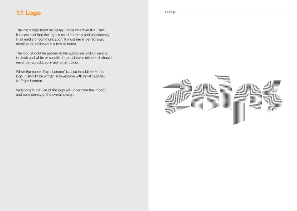
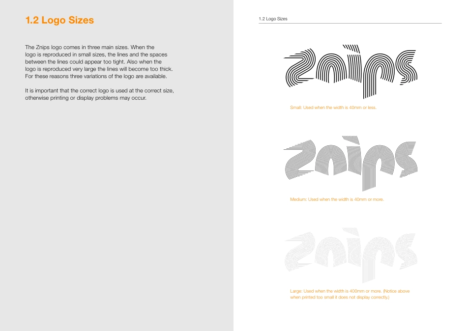
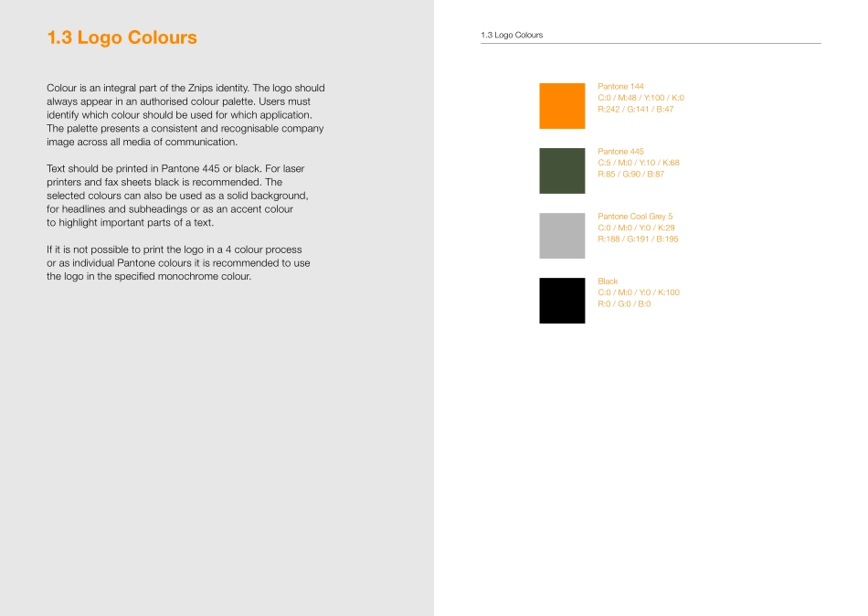
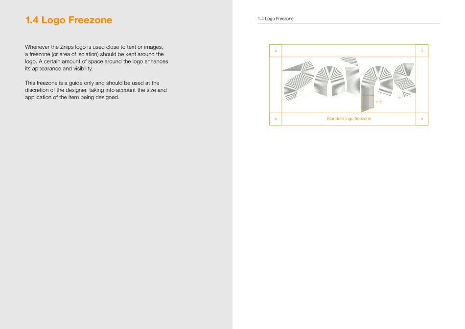
Znips London75 Wilton Road, London SW1V 1DETelephone: +44 (0)20 7828 6688Znips London Identity ManualLogoThis identity manual outlines how to apply the Znips London identity in the correct and originally intended way. It isimportant that everyone involved with the company is familiar with these guidelines and uses them consistently in every aspect of communication.Znips London Identity ManualLogoLogo1.1 Logo1.2 Logo Sizes1.3 Logo Colours1.4 Logo Freezone1.5 Logo Positioning 11.6 Logo Positioning 21.7 Logo Positioning Don’ts1.8 Logo Patterns1.9 Logo Don’tsTypography2.1 Authorised Typefaces2.2 Typographic BasicsStationery3.1 Business Card3.2 Letterhead3.3 Compliment Slip3.4 Fax SheetRetail4.1 Signage4.2 Window Vinyl4.3 ApronsCredits & SupportContentsLogoLogo1.1 LogoThe Znips logo must be clearly visible wherever it is used.It is essential that the logo is used correctly and consistentlyin all media of communication. It must never be redrawn, modified or enclosed in a box or frame.The logo should be applied in the authorised colour palette,in black and white or specified monochrome colours. It should never be reproduced in any other colour.When the name ‘Znips London’ is used in addition to thelogo, it should be written in lowercase with initial capitals,ie: Znips London.Variations in the use of the logo will undermine the impactand consistency of the overall design.1.1 LogoLogo1.2 Logo SizesSmall: Used when the width is 40mm or less.Medium: Used when the width is 40mm or more.Large: Used when the width is 400mm or more. (Notice above when printed too small it does not display correctly.)1.2 Logo SizesThe Znips logo comes in three main sizes. When thelogo is reproduced in small sizes, the lines and the spaces between the lines could appear too tight. Also when thelogo is reproduced very large the lines will become too thick. For these reasons three variations of the logo are available.It is important that the correct logo is used at the correct size, otherwise printing or display problems may occur.Logo1.3 Logo ColoursPantone 144C:0 / M:48 / Y:100 / K:0R:242 / G:141 / B:47Pantone 445C:5 / M:0 / Y:10 / K:68R:85 / G:90 / B:87Pantone Cool Grey 5C:0 / M:0 / Y:0 / K:29R:188 / G:191 / B:195BlackC:0 / M:0 / Y:0 / K:100R:0 / G:0 / B:01.3 Logo ColoursColour is an integral part of the Znips identity. The logo should always appear in an authorised colour palette. Users must identify which colour should be used for which application.The palette presents a consistent and recognisable company image across all media of communication.Text should be printed in Pantone 445 or black. For laser printers and fax sheets black is recommended. Theselected colours can also be used as a solid background,for headlines and subheadings or as an accent colourto highlight important parts of a text.If it is not possible to print the logo in a 4 colour processor as...
