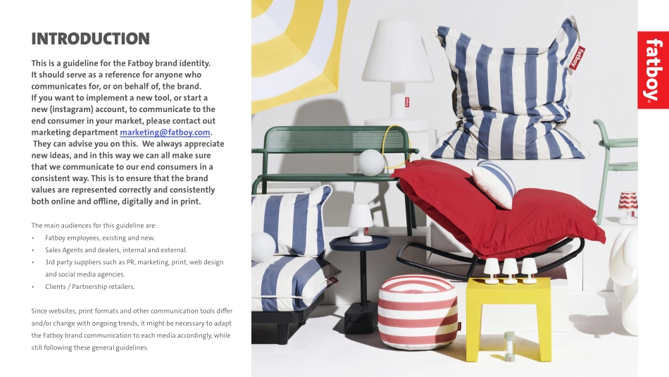
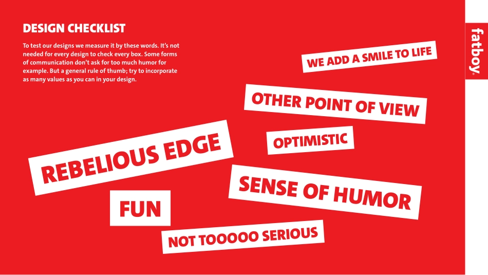
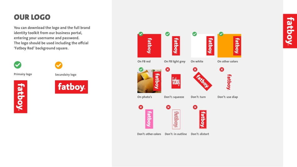
FATBOY BRAND GUIDELINESSeptember 2023Things you should really do and things you cannot do.Hey! That’s us!This is a guideline for the Fatboy brand identity. It should serve as a reference for anyone who communicates for, or on behalf of, the brand. If you want to implement a new tool, or start a new (instagram) account, to communicate to the end consumer in your market, please contact out marketing department marketing@fatboy.com. They can advise you on this. We always appreciate new ideas, and in this way we can all make sure that we communicate to our end consumers in a consistent way. This is to ensure that the brand values are represented correctly and consistently both online and offline, digitally and in print.The main audiences for this guideline are:• Fatboy employees, existing and new.• Sales Agents and dealers, internal and external.• 3rd party suppliers such as PR, marketing, print, web design and social media agencies.• Clients / Partnership retailers.Since websites, print formats and other communication tools differ and/or change with ongoing trends, it might be necessary to adapt the Fatboy brand communication to each media accordingly, while still following these general guidelines.INTRODUCTIONTo test our designs we measure it by these words. It’s not needed for every design to check every box. Some forms of communication don’t ask for too much humor for example. But a general rule of thumb; try to incorporate as many values as you can in your design.REBELIOUS EDGESENSE OF HUMORNOT TOOOOO SERIOUSFUNOPTIMISTICOTHER POINT OF VIEWWE ADD A SMILE TO LIFEDESIGN CHECKLISTYou can download the logo and the full brand identity toolkit from our business portal, entering your username and password.The logo should be used including the offcial ‘Fatboy Red’ background square.OUR LOGOPrimairy logoSecundairy logoDon’t: other colorsDon’t: squeezeDon’t: turnDon’t: use diapDon’t: distortDon’t: in outlineOn FB redOn FB light greyOn whiteOn photo’sOn other colorsOur logo is our recognition. Like on our products, our logo should be positioned on the right hand side of things. We use a simple way of positioning it. How big should it be, you ask? There is no exact formula for this size. It depends on where, what and how the communication is used. Please do not make it too tiny, since it won’t be bold enough. LOGO PLACEMENTXXXXWith borderWithout borderFatboy RedCMYK: 0 / 100 / 100 / 0RGB: 237 / 28 / 36HEX: ED1C24PMS: 186 CFatboy Dark GreyCMYK: 0 / 0 / 0 / 70RGB: 85 / 85 / 85HEX: 555555Fatboy Light GreyCMYK: 0 / 0 / 0 / 7RGB: 242 / 242 / 242HEX: F2F2F2Fatboy Sustainable GreenCMYK: 80 / 35 / 70 / 27RGB: 49 / 105 / 81HEX: 316951COLORSRed, white and grey. That’s what we are about. Make sure to use red and white and light grey as main colors to keep it fresh and recognizable. The dark grey color is mainly us...