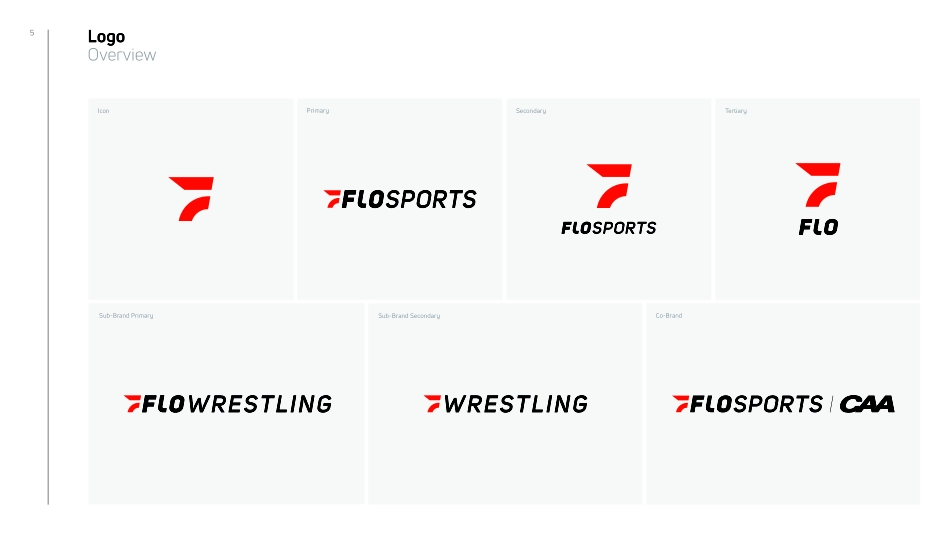
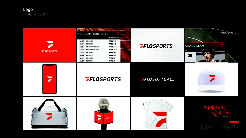
FLOSPORTS BRAND GUIDELINESDATE ISSUED : 08/28/2019EMAIL — BRAND@FLOSPORTS.TVWEB — FLOSPORTS.TVADDRESS — 979 SPRINGDALE RD. STE 120AUSTIN, TX 78702SectionFLOSPORTS BRAND GUIDELINES 2ContentsCONTENTSSection3FLOSPORTS BRAND GUIDELINES Logo SystemLogo System014These brand guidelines explain how to use the FloSports visual identity with confidence and clarity.Our guidelines have been designed to ensure consistency within our brand, helping to create strong, recognizable and innovative communications. The following pages demonstrate both hard line rules and approved areas of flexibility within the identity that should be used to inspire and motivate creative expression.Our unique identity, color palette and typographic style creates distinctive frameworks for our brand which help us stand out from our competitors. Logo Guideline Note5IconPrimarySecondaryTertiarySub-Brand Primary Sub-Brand SecondaryCo-BrandLogo Overview6IconPrimarySecondaryTertiarySub-Brand Primary Sub-Brand SecondaryCo-BrandLogo Overview7LogoIn ApplicationSection8FLOSPORTS BRAND GUIDELINES Master Brand02Logo Master Brand9Master LogoOverviewFILE NAME: 01_FloSports_Master Brand_Outline.ai10The FloSports Icon is the mark of a tribe dedicated to the passion for sport, the spirit of competition, the relentless pursuit of excellence, and is symbolic of the movement of all sports.This is FloSports - Fuel The TribeTribal Icon Story11FloSports Icon is based on simple rectangle and circle geometric rectangle shapes with a 10° angled cut refered to as a “Forward Leaning Stance”. It is carefully constructed to main-tain ownable characteristics while allowing for perfect legibility at any size on any application. 10° AngleIcon ConstructionFILE NAME: 01_FloSports_Master_Brand_Icon_Construction12FloSports Icon is based on simple rectangle and circle geometric rectangle shapes with a 10° angled cut refered to as a “Forward Leaning Stance”. It is carefully constructed to main-tain ownable characteristics while allowing for perfect legibility at any size on any application. Logo ConstructionUni Sans Semibold Italic / Kerning (100)Uni Sans Heavy Italic Tribal IconCustomized (L)13The clear space has been defined to ensure logo visibility and impact. Maintaining the clear space area around the logo and logo lockups when combined with graphic elements such as type, images, other brand logos, etc., ensures that the logo always appears bold, simple and distinctly separate from any oth-er elements.The amount of clear space around primary logo should be equal size or greater than the height of the icon.XLogo ClearspaceX14Logo ScaleOur logo is designed to scale to small sizes on print and screen. Smallest size: 18 pixels wide/0.25 inch wide/0.635 centimeter wide.60% OF HSmallest size: 18 pixels wide/0.25 inch wide/0.635 centimeter wideH15Red Icon Over White16Two Color Primary Over White17Two Color Secondary Over White18Two Color Tertiary Over Whit...
