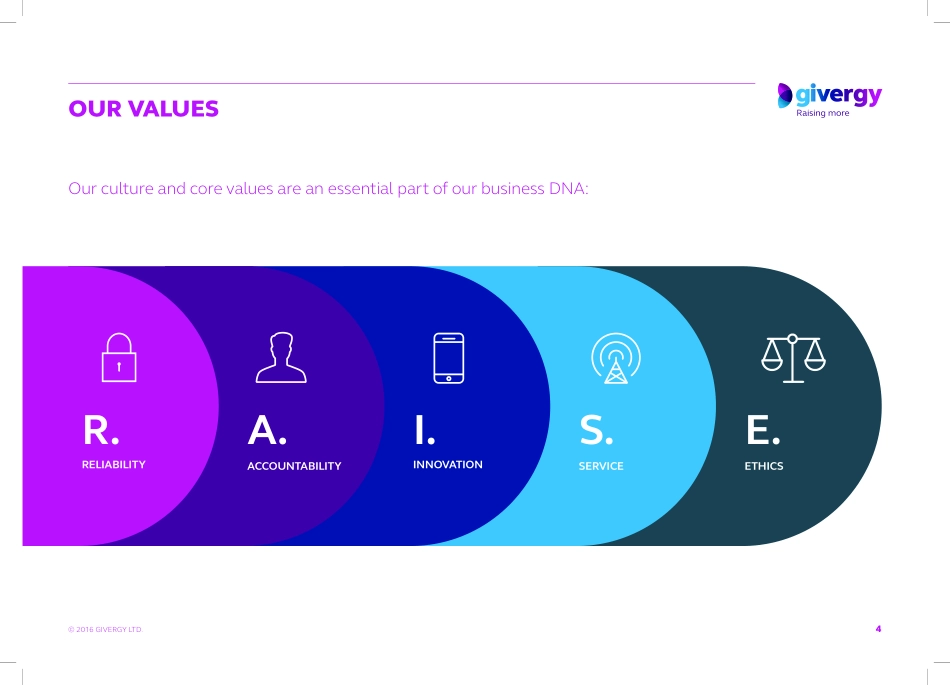
© 2016 GIVERGY LTD.VISUAL IDENTITY GUIDELINESNOVEMBER 2016© 2016 GIVERGY LTD.CONTENTSIntroduction 03Our values 04The Giving Brand 05Logo 06Typography 11Colour palette 12Iconography 14Imagery 15Visual language 18Tone of voice 19Glossary 20Contact 213© 2016 GIVERGY LTD.INTRODUCTIONTHE GIVERGY BRANDAt Givergy we’re as passionate about our brand as we are about helping our clients raise more. Our high standards of client service should be mirrored in the way we deport ourselves through our visual identity and all its aspects.These brand guidelines set the visual standards for the Givergy brand image outlining usage convention for our logos, color palette, typography and infographics; setting out clear rules on the deployment of these components in our brand and marketing collateral. By following the principles outlined in these guidelines, we can maintain cohesion and consistency across all our communications ensuring that we present Givergy as the number one tech partner to the ‘Giving Generation’. 4© 2016 GIVERGY LTD.OUR VALUESOur culture and core values are an essential part of our business DNA:RELIABILITYACCOUNTABILITYINNOVATIONSERVICEETHICSR.A.I.S.E.5© 2016 GIVERGY LTD.THE GIVING BRANDThe ‘Giving Brand’ for the ‘Giving Generation’GIVINGTECHNOLOGYENERGY6© 2016 GIVERGY LTD.LOGOFULL COLOUR MASTER LOGOFor full colour breakdowns please see the colour guidelines section of this documentC28 M93 Y0 K0R188 G43 B135C76 M21 Y0 K0R8 G157 B217C67 M90 Y22 K10R108 G52 B113C100 M87 Y21 K7R36 G55 B118C63 M47 Y40 K27R94 G104 B113The primary gradient is used within the logo, logo icon and as a background colour only.Venn iconGivergy logotype7© 2016 GIVERGY LTD.LOGO VERSIONSLOGO AND STRAPLINE GUIDELINESBLACK MONO LOGOFor use on facsimile and other black and white publications. FULL COLOUR LOGOThe positive version of the logo is always used on clear white or lighter colour tinted backgrounds to maintain legibility.WHITE-OUT LOGOWhen used on dark and coloured backgrounds, the logo should be all white to maintain legibility. This will provide a striking contrast allowing the logo to be clearly legible.LOGO WITHOUT STRAPLINEThe Givergy logo without the strapline may be used in rare situations where the strapline is not required or not appropriate. This may include signage, way-finding or internal communications. LOGO WITH STRAPLINEThe Givergy logo with the strapline should regarded as the primary logo and should be used in the majority of digital and printed collateral. This will include stationery, business cards, advertising and digital and online communications.Two approved versions of the logo have been created with and without the Givergy strapline. Read our usage guidance to understand when each logo should be used.8© 2016 GIVERGY LTD.LOGO USECLEAR SPACE RULEThe Givergy logo must stand out clearly from its surroundings.This applies not only to the background, but...