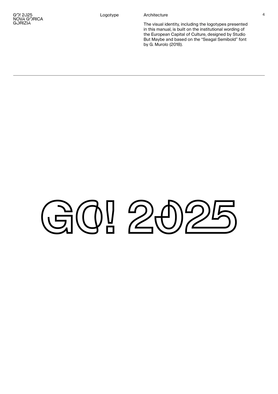
Vers. 1.0 – July 2022Brandguidelines2Introduction 3 Logotype Architecture 4 Outline version 5 Colour use 6 Colour palette 7 Solid version 8 Institutional wording 9 Logo management 10 Incorrect use 11 Summary of files 13 Contacts 14Index3IntroductionThe visual identity of the project GO! 2025 European Capital of Culture Nova Gorica - Gorizia introduces and strengthens the values and objectives of the project. Therefore the correct use of the logo and identity elements is of fundamental importance. This is the only way to coherently introduce the project and all those involved.The logo of the project GO! 2025 should be well separated from any other logos used by the promoting bodies, institutions, sponsors, and partners. On a page, it should be placed in a prominent position and at the highest hierarchical level of the layout.It is allowed to use the logo GO! 2025 on all paper or digital supports in case of all communication activities connected to the European Capital of Culture promoted by institutions, organizations, legal entities and individuals who have requested its use.When using any version of the GO! 2025 project logo, it is necessary to comply with the regulations on the use.Further information: marketing@go2025.eu4LogotypeArchitecture The visual identity, including the logotypes presented in this manual, is built on the institutional wording of the European Capital of Culture, designed by Studio But Maybe and based on the “Seagal Semibold” font by G. Murolo (2018).5Outline version The logo is a graphic comprised of the wordmark "GO! 2025" and the territorial reference "Nova Gorica - Gorizia". The size ratio between the elements of the logo is fixed. 40 mm (length) is the minimum size for the printed version and 94 px for web.Logotype6Colour use The logotype is exported in vector format (CMYK) for print usage and in raster format (RGB) for web. Go the summary (pag. 13) to see all the file.Logotype7Isonzo TurquoiseRGB: 41, 204, 177CMYK: 80, 0, 45, 0Pantone: 929CRal: Tender Turquoise Colour palette The primary colour is the "Isonzo Turquoise". Below you can find the colour conversion codes.Logotype8Solid version Starting with the institutional fonts, the Studio has developed a derived logotype, easier to read, mainly to be used when it is necessary to go below the minimum dimension of the outline logotype (4 cm in width).Logotype9Institutional wording All the variants of the institutional headers have been derived from the solid version. Such variants are allowed only in three languages (English, Italian, and Slovene) or only in English (Italian only or Slovene only must never be used).Logotype10Length: 4 cmLogo management As stated in the previous pages, using the solid variant of the logo is highly recommended if the logotype width is smaller than 4 cm. We recall that the minimum width size for printing is 1,5 cm....