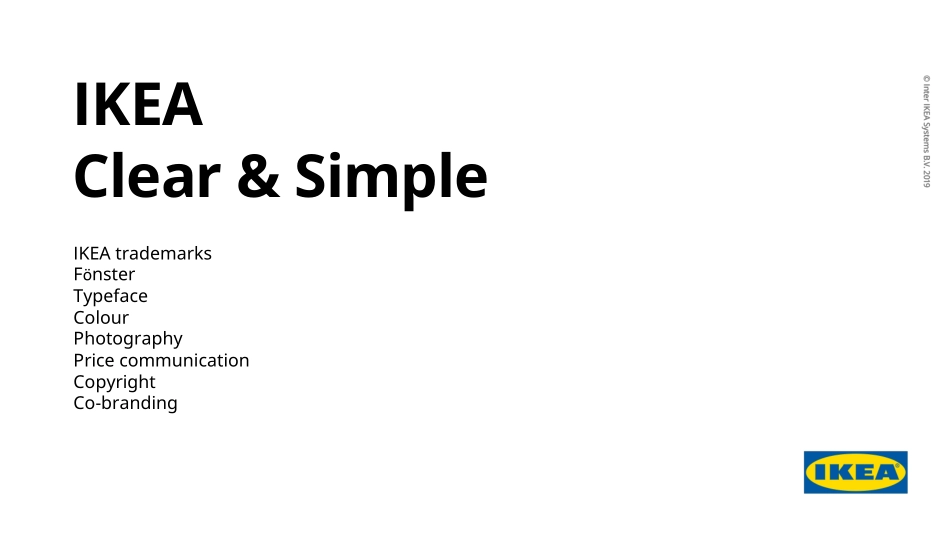
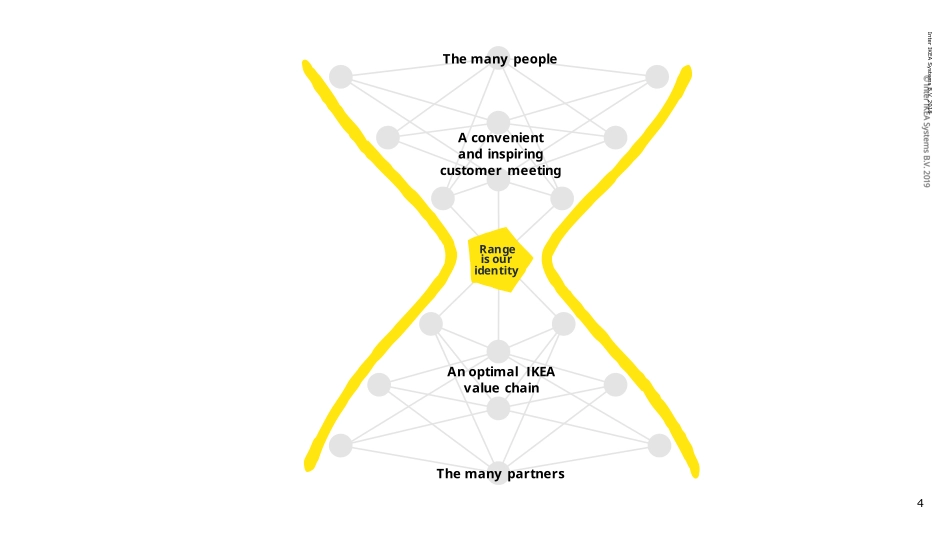
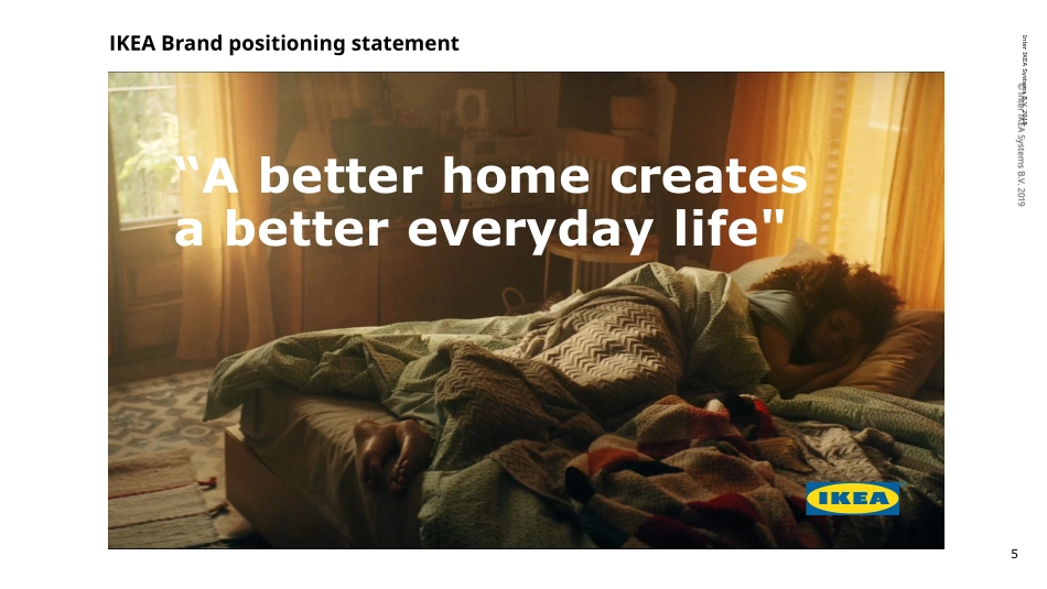
1Clear & SimpleIKEA Clear & SimpleIKEA trademarksFönsterTypefaceColourPhotographyPrice communicationCopyrightCo-branding4Inter IKEA Systems B.V. 2018Range is our identityAn optimal IKEA value chainThe many partnersA convenient and inspiring customer meetingThe many people5Inter IKEA Systems B.V. 2018“A better home creates a better everyday life"IKEA Brand positioning statement5IKEA TrademarksOur trademark hasn’t evolved since the arrival of the internet. WEBMOBILE & SOCIALINNER CITYGROWTH MARKETS19432018COLABSAR / VR?Our current trademark doesn’t adapt neatly or consistently to new environments / touchpoints. Consequently, IKEA trademark gets lost.19511954196719811983—PresentOur new optimized IKEA logo.1.The logomark has now been optimised for the ‘future’ of the brand.2.Within the same amount of media space, we increase the optical size of the brand name by 15%. Building greater awareness and presence across all touchpoints. This is more necessary than ever before for the brand moving into the future.OldCurrent8IKEA Trademarks: to build a strong brand.As a complement to the blue and yellow IKEA logo, there are other authorised versions available. If it is not possible to use the IKEA logo in blue and yellow, use one of these versions.9IKEA Trademarks: How to apply and work with?IKEA in running textThe word IKEA must always be written in capital letters. When used in running text, the word IKEA must always be written in the same size and typeface as the accompanying text.The ® in running text, shall only be used for headlines, titles, captions larger than 14 points in the IKEA typeface. Any size under 14 points shall not use the ® at all.The registered trademark symbol ® is set in 25% of the typeface size used in the headline.10IKEA Trademarks: How to apply and work with?IKEA logo free zoneThe free zone guarantees the clarity and visibility of the IKEA logo. Any messages or other visual elements must be placed outside the free zone.The 100% IKEA logo free zone: to make sure the IKEA logo always stands out, the size of the free zone around the logo should always be 100%.The 25% IKEA logo free zone: due to technical or practical circumstances, a 25% free zone can be applied. This should only be used for smaller spaces, e.g., digital applications and smaller print applications.The 100% IKEA logo free zoneThe 25% IKEA logo free zone11IKEA Trademarks: How to apply and work with?IKEA logo on backgrounds•The IKEA logo on a white background is always preferred.•The second preferred background is the IKEA Brand yellow colour.•The IKEA logo could also be placed on a light grey background.•If you put the IKEA logo on a picture, always ensure it is clearly distinguished from the background.•Never use the IKEA Brand blue colour as a background for the IKEA logo.•Never place the IKEA logo on a black background, as it cannot be disti...