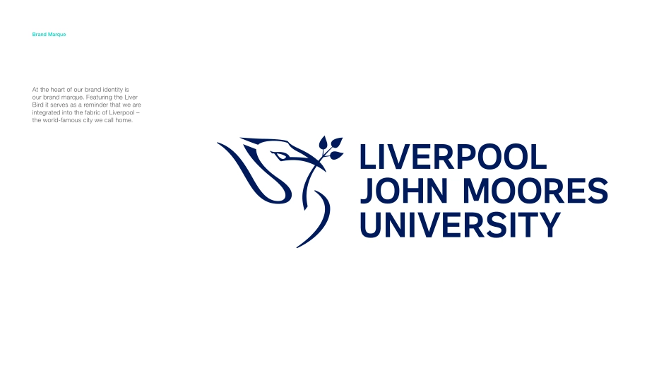
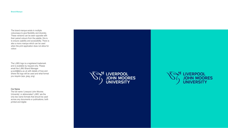
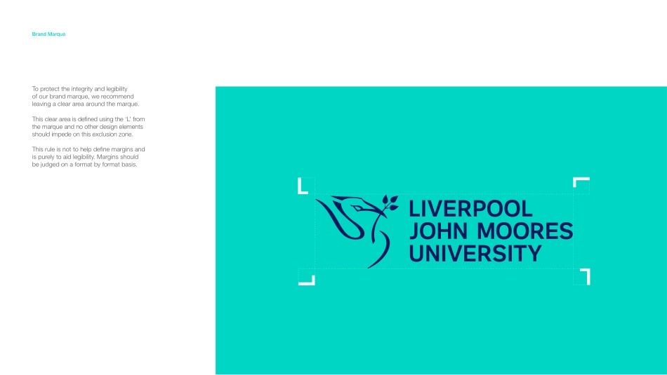
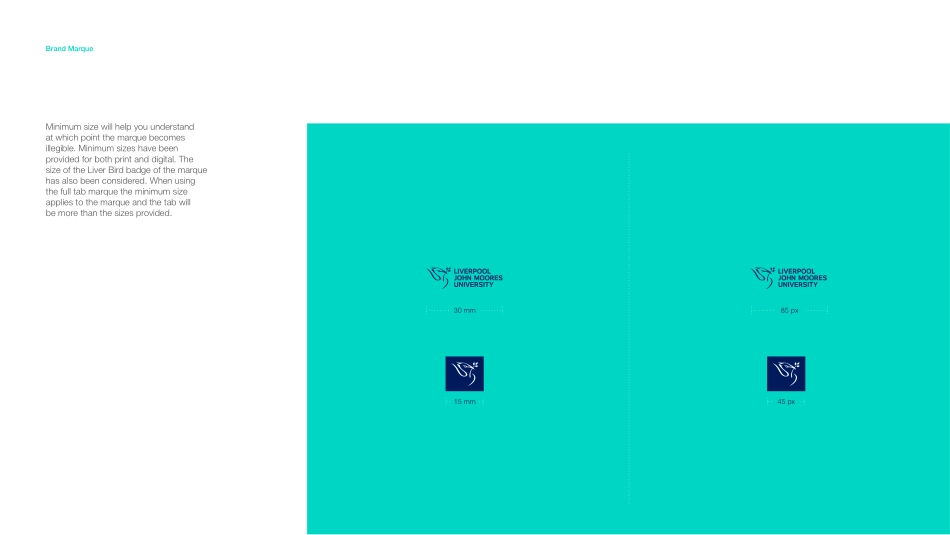
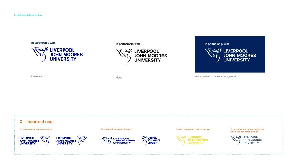
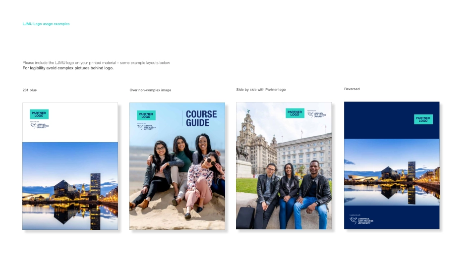
Oct 2020BRAND GUIDELINESFOR PARTNER INSTITUTIONSBrand PropositionOur city and our university stand tall together. We have grown from the confident, ambitious origins of Liverpool and have a shared history built on working hard, caring about supporting people and communities and being proud of who we are.We have a distinct place in this lively city with our warm, friendly and open people. We share a spirit of adventure with a community striving to make a difference and put something back.Our staff, students and alumni are the beating heart of this university, with an impact that goes beyond academic, economic and social measures. It can be seen in our physical footprint around the city, our global connections and how often you will meet someone who has been transformed by a connection with our university and has helped transform the lives of others.Making a difference is what a university should be about. It is what we are about. It is who we are. It is Liverpool John Moores University.LJMU TOGETHER – MAKING A DIFFERENCEAt the heart of our brand identity is our brand marque. Featuring the Liver Bird it serves as a reminder that we are integrated into the fabric of Liverpool –the world-famous city we call home.Brand MarqueBrand MarqueThe brand marque exists in multiple colourways to give flexibility and diversity. These versions can be seen opposite with their paired colours from the palette, this is to ensure usability and accessibility. There is also a mono marque which can be used when the print application does not allow for colour.The LJMU logo is a registered trademark and is available by request only. Please email the LJMU Brand Manager g.scott@ljmu.ac.uk with details of how andwhere the logo will be used and what formatyou require (eps, jpeg, png)Our NameThe full name ‘Liverpool John Moores University’ or abbreviated ‘LJMU’ are the only two name formats that should be used across any documents or publications, both printed and digital.To protect the integrity and legibility of our brand marque, we recommend leaving a clear area around the marque.This clear area is defined using the ‘L’ from the marque and no other design elements should impede on this exclusion zone. This rule is not to help define margins and is purely to aid legibility. Margins should be judged on a format by format basis.Brand MarqueMinimum size will help you understand at which point the marque becomes illegible. Minimum sizes have been provided for both print and digital. The size of the Liver Bird badge of the marque has also been considered. When using the full tab marque the minimum size applies to the marque and the tab will be more than the sizes provided.30 mm85 pxBrand Marque15 mm45 pxIn partnership logo versionIn partnership withIn partnership withPantone 281MonoIn partnership withWhite reversed on colour backgroundDo not...
