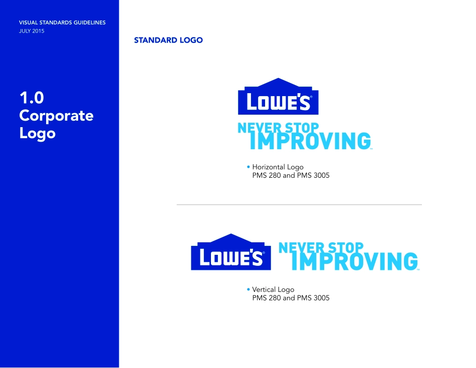
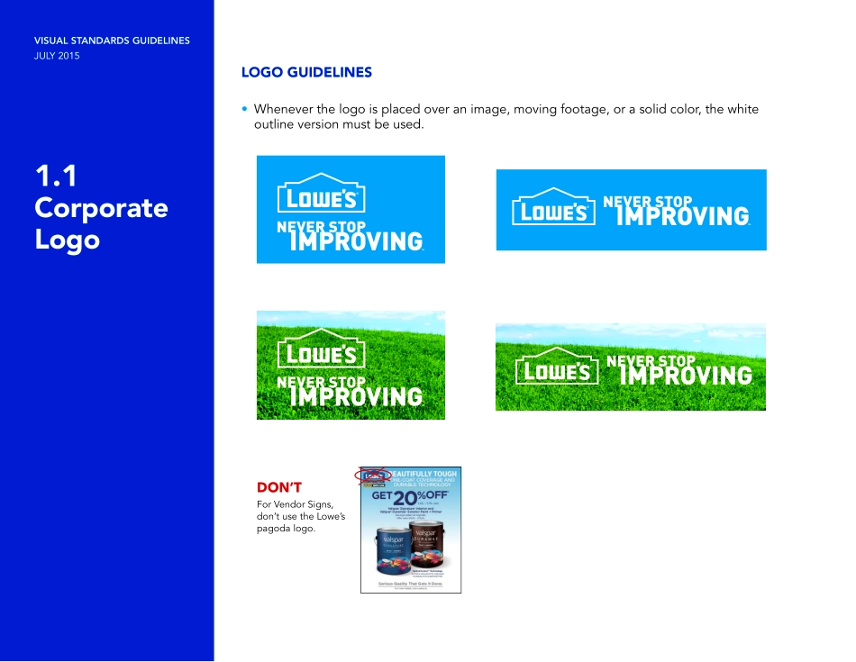
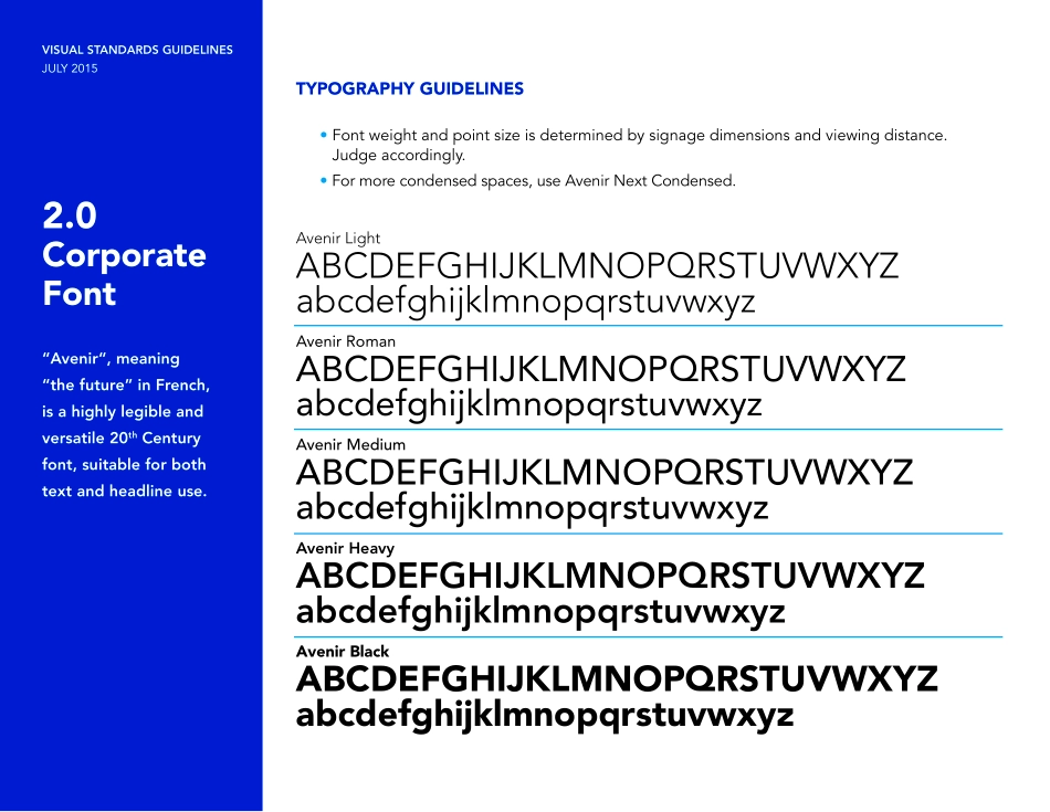
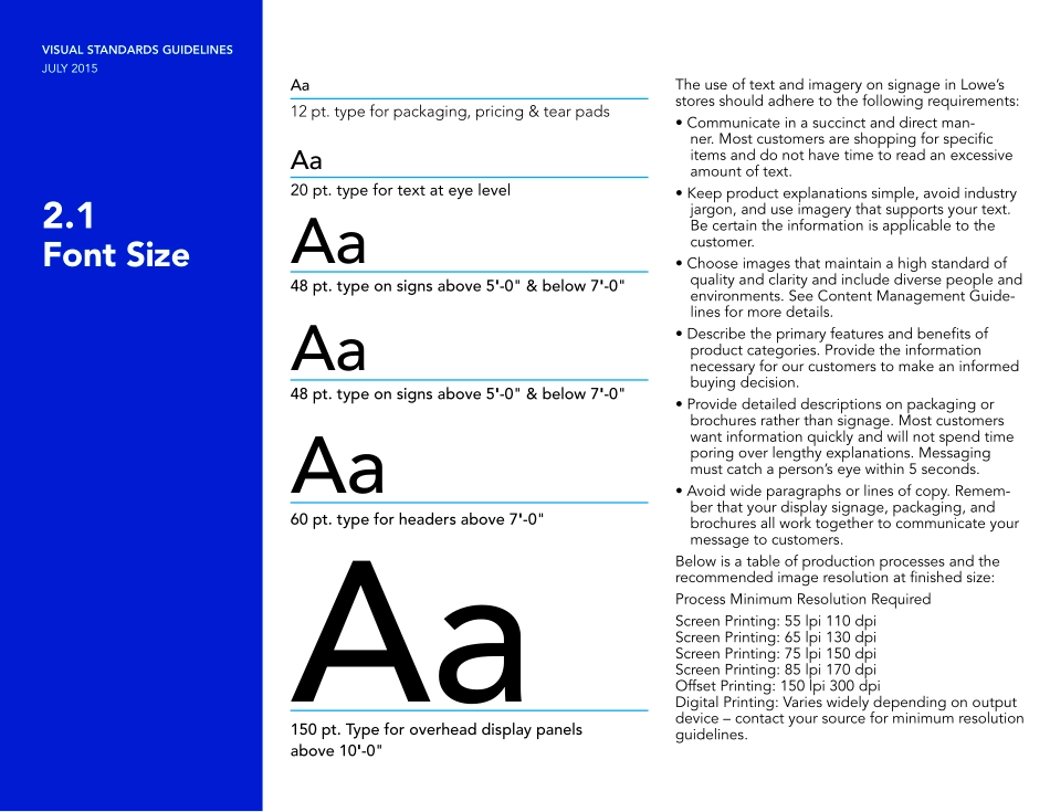
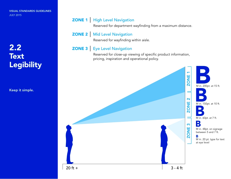
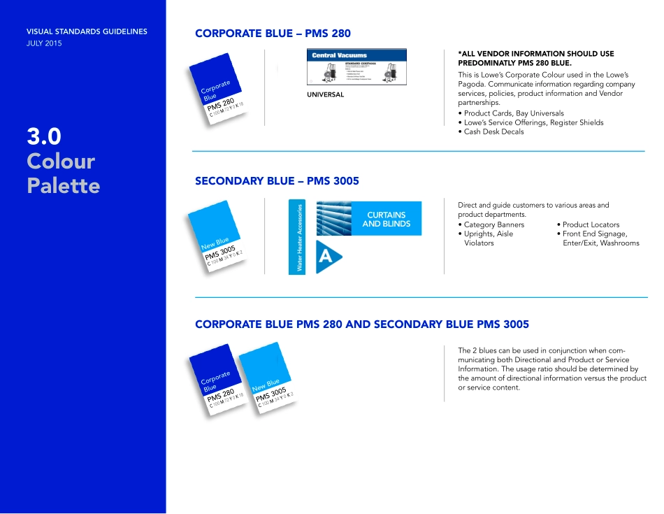
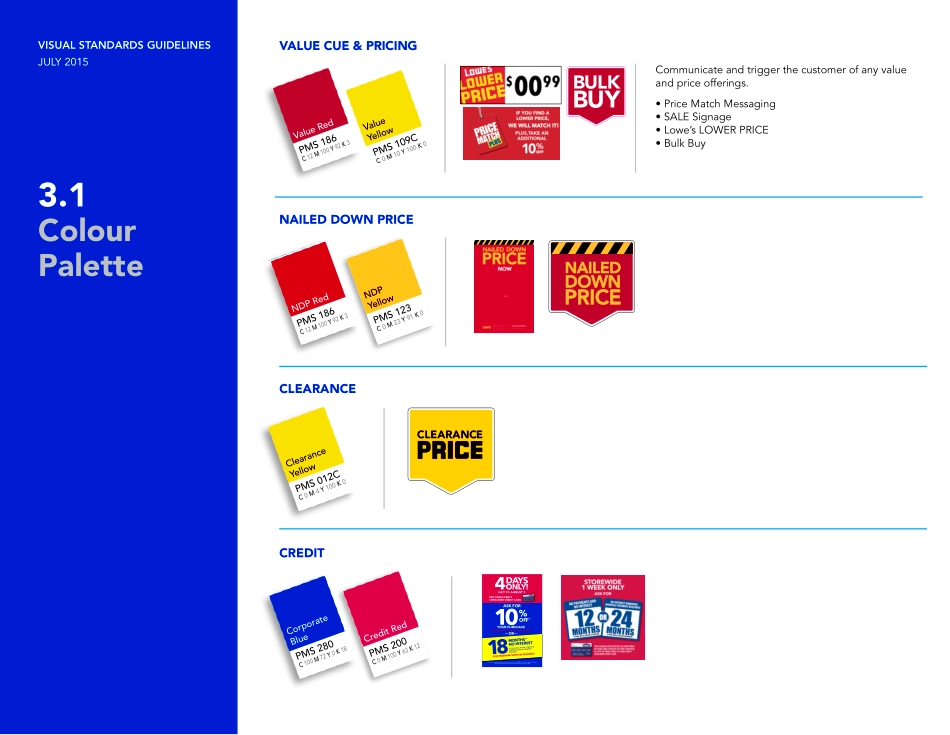
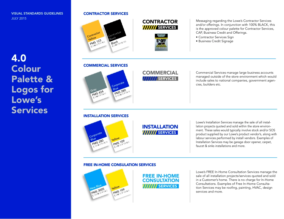
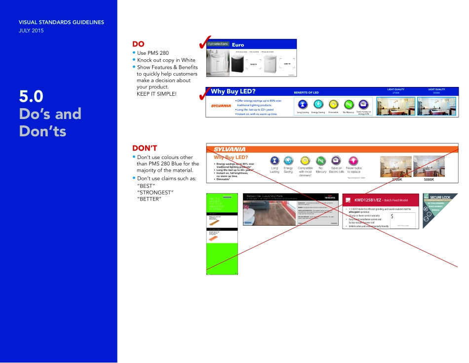
VISUAL STANDARDS GUIDELINESJULY 2015VisualStandardsGuidelinesVISUAL STANDARDS GUIDELINESJULY 20151.0Corporate LogoSTANDARD LOGO • Horizontal Logo PMS 280 and PMS 3005• Vertical Logo PMS 280 and PMS 3005VISUAL STANDARDS GUIDELINESJULY 20151.1Corporate LogoLOGO GUIDELINES• Whenever the logo is placed over an image, moving footage, or a solid color, the white outline version must be used.For Vendor Signs, don’t use the Lowe’s pagoda logo.DON’TVISUAL STANDARDS GUIDELINESJULY 20152.0Corporate Font“Avenir“, meaning “the future” in French, is a highly legible and versatile 20th Century font, suitable for both text and headline use.TYPOGRAPHY GUIDELINES • Font weight and point size is determined by signage dimensions and viewing distance. Judge accordingly. • For more condensed spaces, use Avenir Next Condensed.Avenir LightABCDEFGHIJKLMNOPQRSTUVWXYZabcdefghijklmnopqrstuvwxyzAvenir RomanABCDEFGHIJKLMNOPQRSTUVWXYZabcdefghijklmnopqrstuvwxyzAvenir MediumABCDEFGHIJKLMNOPQRSTUVWXYZabcdefghijklmnopqrstuvwxyzAvenir HeavyABCDEFGHIJKLMNOPQRSTUVWXYZabcdefghijklmnopqrstuvwxyzAvenir BlackABCDEFGHIJKLMNOPQRSTUVWXYZabcdefghijklmnopqrstuvwxyzVISUAL STANDARDS GUIDELINESJULY 20152.1Font SizeThe use of text and imagery on signage in Lowe’s stores should adhere to the following requirements:• Communicate in a succinct and direct man-ner. Most customers are shopping for specific items and do not have time to read an excessive amount of text.• Keep product explanations simple, avoid industry jargon, and use imagery that supports your text. Be certain the information is applicable to the customer.• Choose images that maintain a high standard of quality and clarity and include diverse people and environments. See Content Management Guide-lines for more details.• Describe the primary features and benefits of product categories. Provide the information necessary for our customers to make an informed buying decision.• Provide detailed descriptions on packaging or brochures rather than signage. Most customers want information quickly and will not spend time poring over lengthy explanations. Messaging must catch a person’s eye within 5 seconds.• Avoid wide paragraphs or lines of copy. Remem-ber that your display signage, packaging, and brochures all work together to communicate your message to customers.Below is a table of production processes and the recommended image resolution at finished size:Process Minimum Resolution RequiredScreen Printing: 55 lpi 110 dpiScreen Printing: 65 lpi 130 dpiScreen Printing: 75 lpi 150 dpiScreen Printing: 85 lpi 170 dpiOffset Printing: 150 lpi 300 dpiDigital Printing: Varies widely depending on output device – contact your source for minimum resolution guidelines.AaAaAaAaAaAa12 pt. type for packaging, pricing & tear pads20 pt. type for text at eye level48 pt. type on signs above 5'-0" & below 7'-0"48 pt. type on signs above 5'-0" & below 7'-0"60 pt. type for headers above 7'-0"1...
