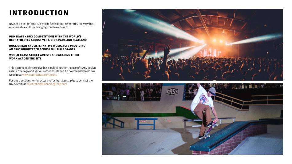
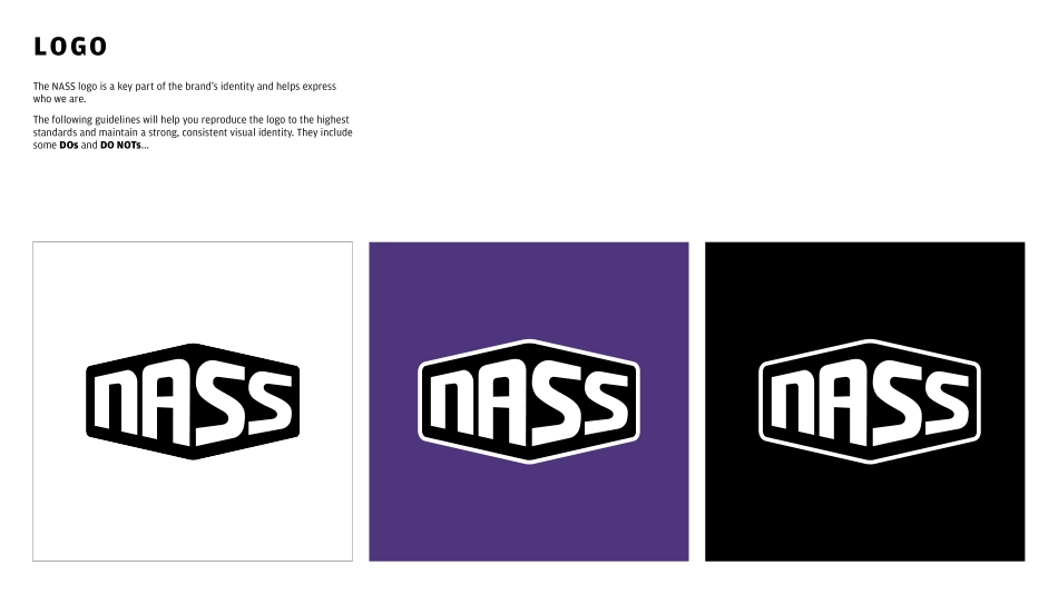
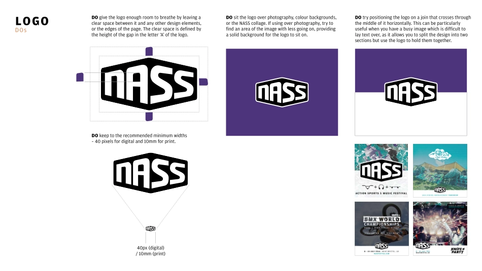
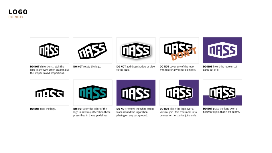
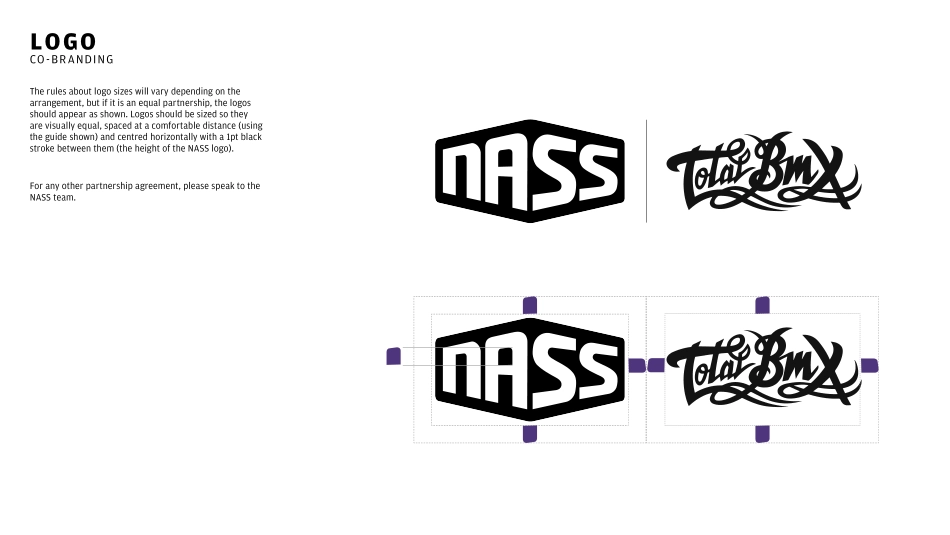
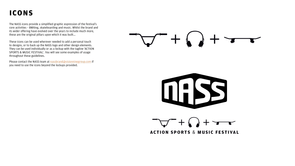
BRAND GUIDELINES 2017INTRODUCTIONNASS is an action sports & music festival that celebrates the very best of alternative culture, bringing you three days of: PRO SKATE + BMX COMPETITIONS WITH THE WORLD’S BEST ATHLETES ACROSS VERT, DIRT, PARK AND FLATLANDHUGE URBAN AND ALTERNATIVE MUSIC ACTS PROVIDING AN EPIC SOUNDTRACK ACROSS MULTIPLE STAGESWORLD-CLASS STREET ARTISTS SHOWCASING THEIR WORK ACROSS THE SITE This document aims to give basic guidelines for the use of NASS design assets. The logo and various other assets can be downloaded from our website at www.nassfestival.com/press For any questions, or for access to further assets, please contact the NASS team at nassbrand@visionninegroup.comLOGOThe NASS logo is a key part of the brand’s identity and helps express who we are.The following guidelines will help you reproduce the logo to the highest standards and maintain a strong, consistent visual identity. They include some DOs and DO NOTs...LOGODOsDO sit the logo over photography, colour backgrounds, or the NASS collage. If using over photography, try to find an area of the image with less going on, providing a solid background for the logo to sit on.DO give the logo enough room to breathe by leaving a clear space between it and any other design elements, or the edges of the page. The clear space is defined by the height of the gap in the letter ‘A’ of the logo.DO try positioning the logo on a join that crosses through the middle of it horizontally. This can be particularly useful when you have a busy image which is difficult to lay text over, as it allows you to split the design into two sections but use the logo to hold them together.DO keep to the recommended minimum widths – 40 pixels for digital and 10mm for print. 40px (digital) / 10mm (print) LOGODO NOTsDON’TDO NOT distort or stretch the logo in any way. When scaling, use the proper linked proportions.DO NOT rotate the logo.DO NOT add drop shadow or glow to the logo.DO NOT cover any of the logo with text or any other elements.DO NOT crop the logo.DO NOT alter the color of the logo in any way other than those prescribed in these guidelines.DO NOT remove the white stroke from around the logo when placing on any background.DO NOT place the logo over a vertical join. This treatment is to be used on horizontal joins only.DO NOT place the logo over a horizontal join that is off-centre.DO NOT invert the logo or cut parts out of it.LOGOCO-BRANDINGThe rules about logo sizes will vary depending on the arrangement, but if it is an equal partnership, the logos should appear as shown. Logos should be sized so they are visually equal, spaced at a comfortable distance (using the guide shown) and centred horizontally with a 1pt black stroke between them (the height of the NASS logo).For any other partnership agreement, please speak to the NASS team.ICONS...