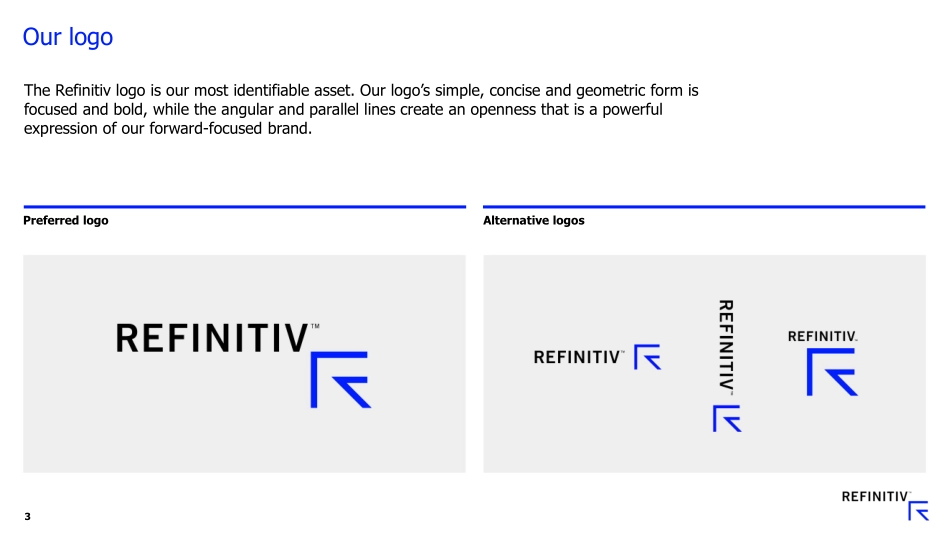
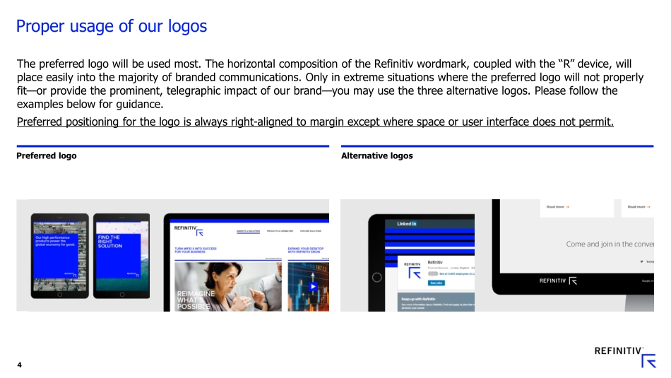
Refinitiv Partner Brand GuidelinesMay 2019Logo3Our logoThe Refinitiv logo is our most identifiable asset. Our logo’s simple, concise and geometric form is focused and bold, while the angular and parallel lines create an openness that is a powerful expression of our forward-focused brand.Preferred logoAlternative logos4Proper usage of our logosThe preferred logo will be used most. The horizontal composition of the Refinitiv wordmark, coupled with the “R” device, willplace easily into the majority of branded communications. Only in extreme situations where the preferred logo will not properly fit—or provide the prominent, telegraphic impact of our brand—you may use the three alternative logos. Please follow the examples below for guidance.Preferred positioning for the logo is always right-aligned to margin except where space or user interface does not permit.Preferred logoAlternative logos5Logo clear space an minimum sizeThis is the minimum amount of clear space – but the more the betterThis is the minimum size for our logo. Never make the logo smaller, as that will compromise it’s qualityIMPORTANT:Please never stretch or compress the logo in a way that distorts its size, shape, or clarity.6Powered by Refinitiv LogoThe ‘Powered By Refinitiv’ logo is only available for use when Refinitiv data or technology is enabling a partners display or application to run. See citation guidance to know when it should be used.Color: palette, formulation, and expression8Our color paletteOur color palette leads with the distinctive and vibrant Refinitiv Blue. Featured prominently in our communications, Refinitiv Blue expresses our confidence and energy—and stands out in a crowd. We then ensure ample white space in our communications, with the majority of the workhorse typography set in black.We then have a supporting chromatic vocabulary in our accent colors— which are crisp, clean, and compelling—reinforcing our focus and boldness.Core colorsAccent colors9Our color formulationsUse the color specifications shown below to apply our color palette consistently across our branded communications. In order to ensure the optimal impact and effectiveness of our printed materials, please use the spot Pantone 2935 C wherever possible. The CMYK formulation should only be used when a spot Pantone color application is significantly cost-prohibitive for your project(s).Important: When working on activating the Refinitiv brand in other physical-based media other than ink-on-paper, please make sure that vinyl, paint, foil, fabric—and any other substrate used—is matched by your vendor to the spot Pantone designation shown below, and not the CMYK formulations. Core colors0/30/255#001EFFPantone 2935 C100/56/0/0255/255/255#FFFFFF0/0/0/00/0/0#0000000/0/0/100Refinitiv BlueWhiteBlackAccent colors238/238/238#EEEEEEPantone 649 C0/0/0/7216/218/217#D8DAD9Pantone 427 C0/0/0/15255/80/0#FF5000Pantone 2026 C0/82/9...