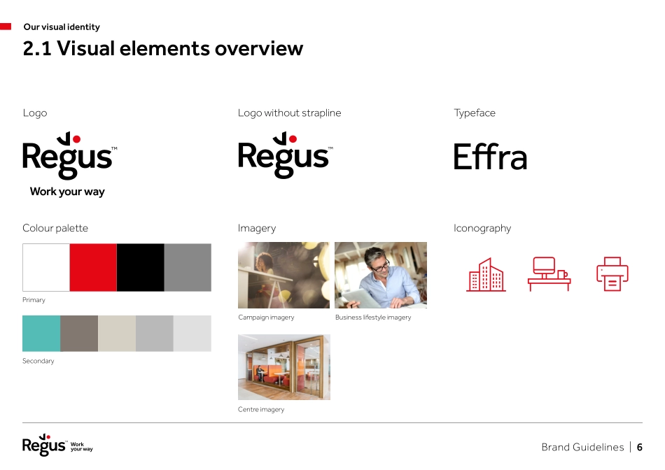
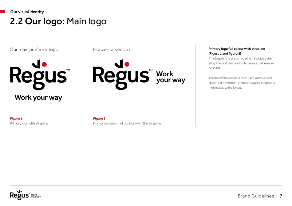
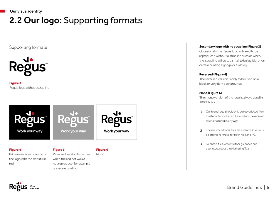
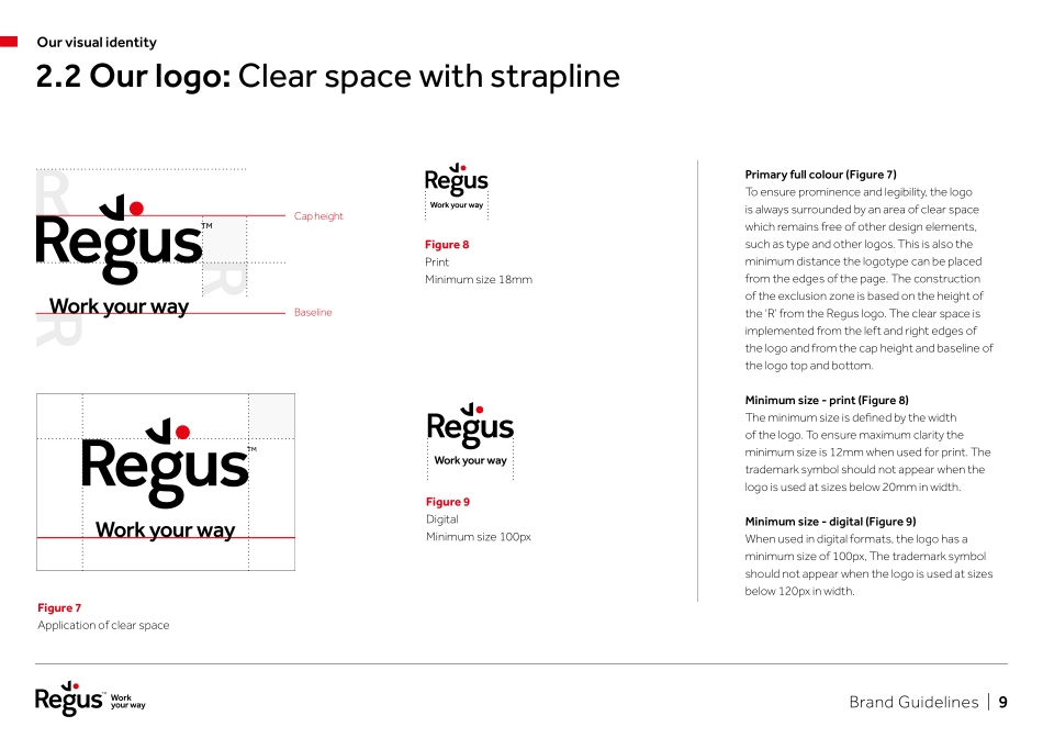
Brand Guidelines.V1.0 | July 2019 Brand Guidelines | 2 1.0 Our brand message 1.1 Introduction p3 1.2 Our proposition p42.0 Our visual identity 2.1 Visual elements overview p60 2.2 Our logo p70 2.3 Brand colours p142.4 Typeface p162.5 Tone of voice p182.6 Branding messaging p212.6 Components p222.7 Dual branding p252.8 Layout p263.0 Photography 3.1 Campaign imagery p35 3.2 Business lifestyle imagery p36 3.2 Centre imagery p37ContentsBrand Guidelines | 3 1.1 IntroductionOur brand messageAt Regus our goal is to build a successful global brand across all our regions maintaining a unified message across the many different cultures. A strong, consistent message reinforces not only who we are and why we exist, but also drives recognition, trust, success, and of course, ultimately, business growth.The following pages in this guide illustrate how we visually represent Regus to our customers. It covers all our key brand elements, and plays an important role in building our brand identity. Please take the time to read and understand these messages so our brand is consistent all around the world.Brand Guidelines | 4 1.2 Our propositionOur brand messageWork your way.We’ve made it our mission to help businesses choose a way of working that’s best for their people.Global networkSo we created a global network of workspaces that enable people to work closer, better, faster, happier, together, and in a more agile way.Brand Guidelines | 5 Our visual identity.Brand Guidelines | 6 2.1 Visual elements overviewOur visual identityLogoColour paletteImageryIconographyPrimaryCentre imagerySecondaryTypefaceEffraLogo without straplineCampaign imageryBusiness lifestyle imageryBrand Guidelines | 7 Primary logo full colour with strapline (Figure 1 and figure 2) This logo is the preferred which includes the strapline and the option to be used whenever possibleThe horizontal version is to be used when vertical space is at a minimum or the left aligned strapline is more suited to the layout.Figure 1 Primary logo with straplineOur main preferred logoHorizontal version2.2 Our logo: Main logoOur visual identityFigure 2 Horizontal version of our logo with the straplineBrand Guidelines | 8 Secondary logo with no strapline (Figure 3) Occasionally the Regus logo will need to be reproduced without a strapline such as when the strapline will be too small to be legible, or on certain building signage or frosting. Reversed (Figure 4) The reversed version is only to be used on a black or very dark backgrounds.Mono (Figure 6) The mono version of the logo is always used in 100% black.Our brand logo should only be reproduced from master artwork files and should not be redrawn, reset or altered in any way.The master artwork files are available in various electronic formats, for both Mac and PC.To obtain files, or for further guidance and queries, contact the Marketing Team.Figure 4...
