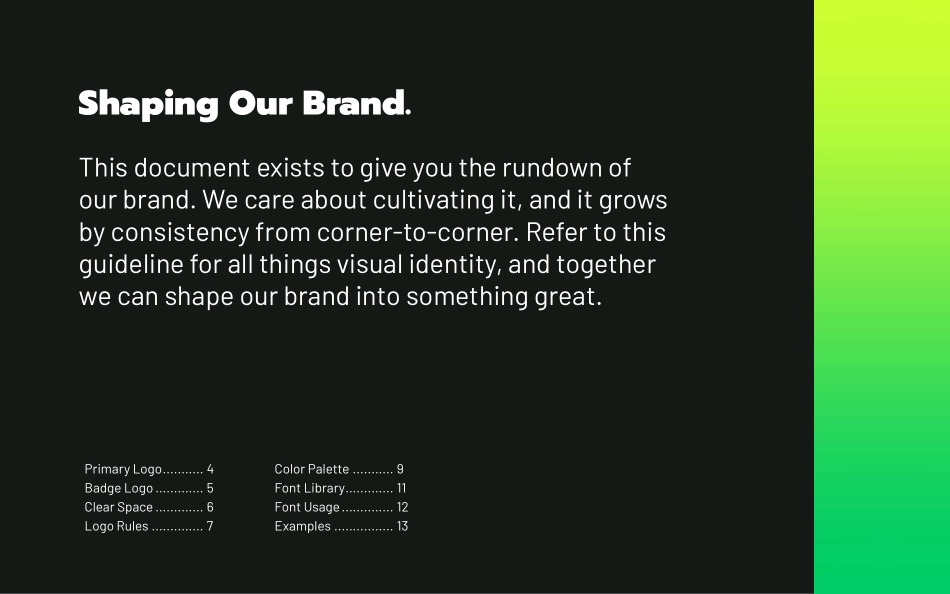
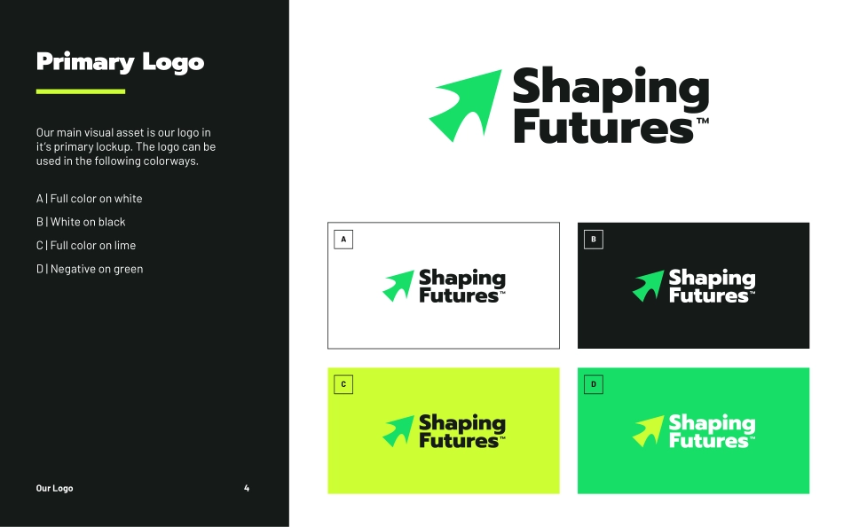
Brand GuidelinesShaping Our Brand.This document exists to give you the rundown of our brand. We care about cultivating it, and it grows by consistency from corner-to-corner. Refer to this guideline for all things visual identity, and together we can shape our brand into something great.Primary Logo ........... 4Badge Logo ............. 5Clear Space ............. 6Logo Rules .............. 7Color Palette ........... 9 Font Library ............. 11Font Usage .............. 12Examples ................ 13Our LogoPrimary LogoOur main visual asset is our logo in it’s primary lockup. The logo can be used in the following colorways.A | Full color on whiteB | White on blackC | Full color on limeD | Negative on greenOur Logo 4ACBDBadge LogoFor square spaces, profile pictures, or for touchpoints that need some flare, our badge logo can be used.A | Full color on whiteB | Lime and green on blackC | Green on limeD | Lime on greenOur Logo 5ACBDClear SpaceWe want our logo to shine, no matter where it lives. To do so, it needs to have ample clear space. We have defined parameters to makesure no other elements encroach on this clear space.Since our badge logo is used with more flare, it is not restrained by clear space. As shown, it is able to be on top of other elements. If it is behind elements, make sure the name and arrow are easily seen.Our Logo 6Your new dream job is here.Hey there, grad!Get ready for new horizons!Logo Rules1. Do not stretch or distort the logo in any way.2. Do not change the color of our logo beyond the allowable color options.3. Do not rotate the primary logo.4. Do not change the transparency of the logo.5. Do not add effects to the logo.6. Do not rearrange the logo’s elements.7. Do not put the logo on a background that deems it illegible or unappealing.8. Do not change the size of the elements.9. Do not render under poor resolution or sharpness.Our Logo 71.4.7.2.5.8.3.6.9.Our ColorsColor PaletteOur colors add energy to our identity. Black and white are the base colors of our palette, with green and lime serving as accents. All four of our colors can be used in the same layout.Our Colors 9BlackGreenLimeWhiteHEX #141a17C: 75 M: 64 Y: 68 K: 78R: 20 G: 26 B: 23HEX #00cc66C: 71 M: 0 Y: 83 K: 0R: 0 G: 204 B: 102HEX #ccff33C: 25 M: 0 Y: 100 K: 0R: 204 G: 255 B: 51HEX #ffffffC: 0 M: 0 Y: 0 K: 0R: 255 G: 255 B: 255Our FontsFont LibraryThree fonts build the typography system of our brand. Prompt Black is used in our wordmark and is the most distinguished font in our library. Headers should be in Prompt Black as often as possible.Barlow Regular is our workhorse font, being used for all body text as well as captions and subheaders.When text needs to be emphasized, or an additional subheader style is needed, Barlow Medium Italic should be used.Our Fonts 11AaAaAaBarlow RegularBody text | Captions | SubheadersPrompt BlackWordmark | HeadersBarlow Medium ItalicSubheaders | Emphasized TextFont UsageThe adjacent examples showcase how to use the three brand fonts together. When selecting color pairings for fonts, always ensure there is enough contrast to provide ample legibility.Our Fonts 12This is a bold, big headline.This is a subheader option.This is what body text looks like. Lorem ipsum dolor sit amet, consectetur adipiscing elit. Vivamus porta in sem at egestas. Sed ultrices diam nibh. In pulvinar sit amet ante id condimentum.To make a point, you can use two fonts.Another subheader option looks like this.ExamplesReach your dreams without a degree.Banner DesignT-Shirt DesignInstagram PostsFor questions about using these guidelines, contact hello@creativechameleonstudio.com运营动脉关于我们ABOUT US WWW.YYDM.CN运营动脉是一个精心管理了4年的运营资料库,目前拥有超过60000+ 份运营资料,1000+运营渠道合作资源。当你在日常工作中,可以用它快速搜方案、看案例、读报告、做课件、找模板、下素材、用工具、学课程等。90%常见的运营需求都可找到模板和案例,工作中即可拿来直接套用,提高我们的工作效率,资料库持续更新ing…运营动脉官方服务号运营资料铺官方公众号运营动脉官方网站运营动脉APP下载业务联系站长微信