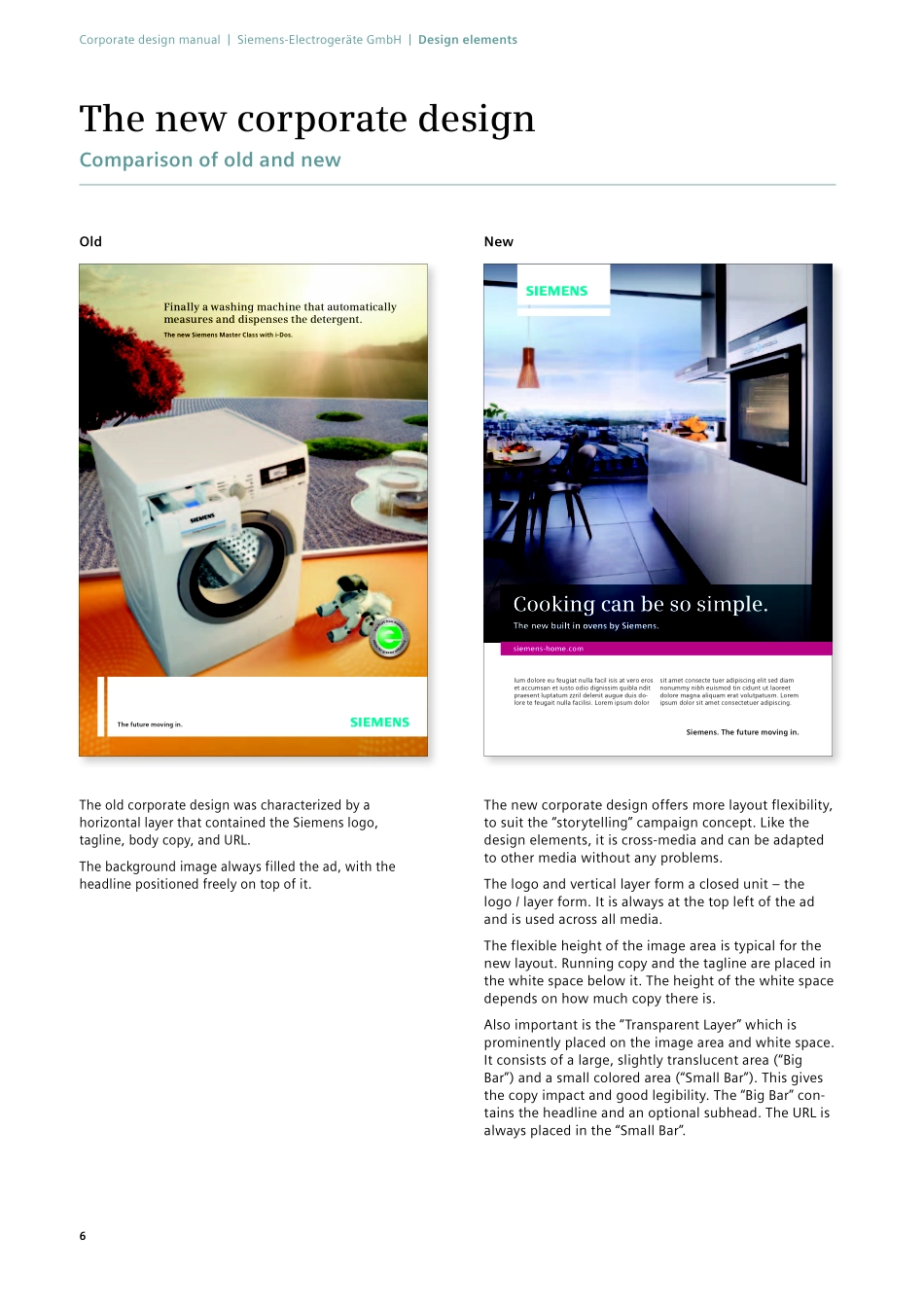
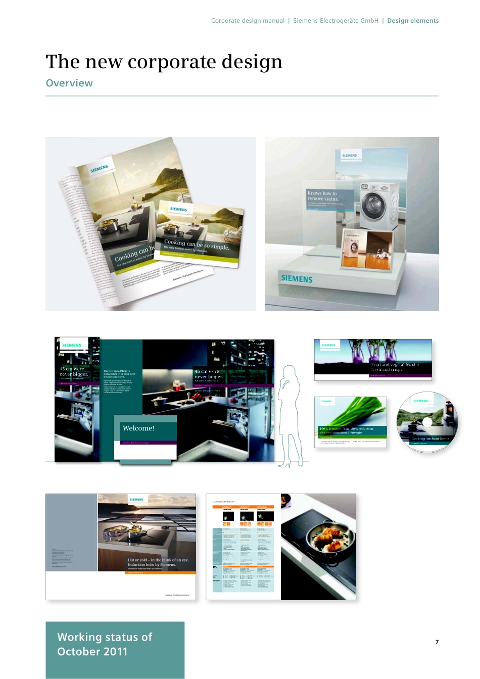
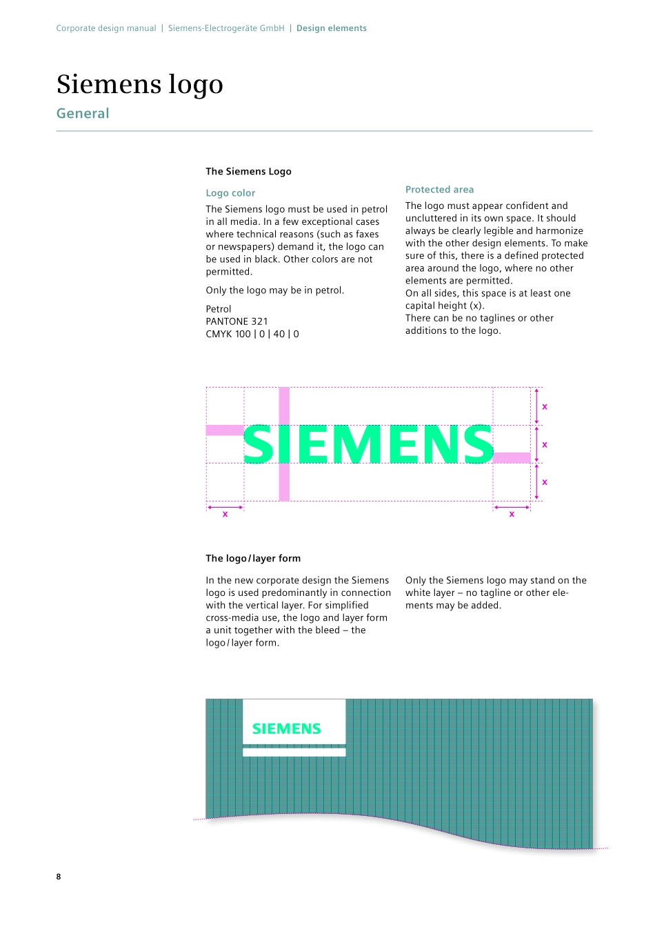
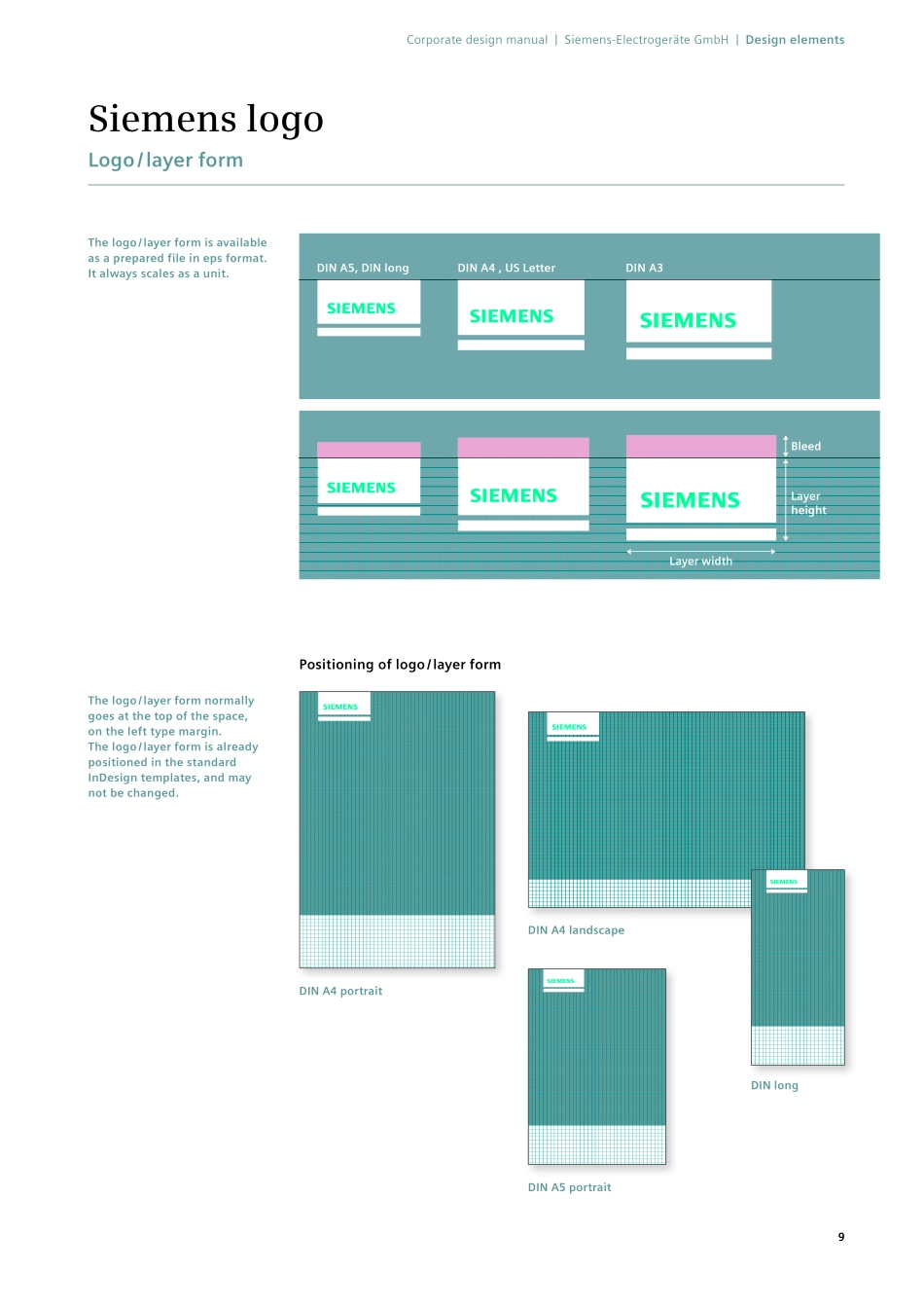
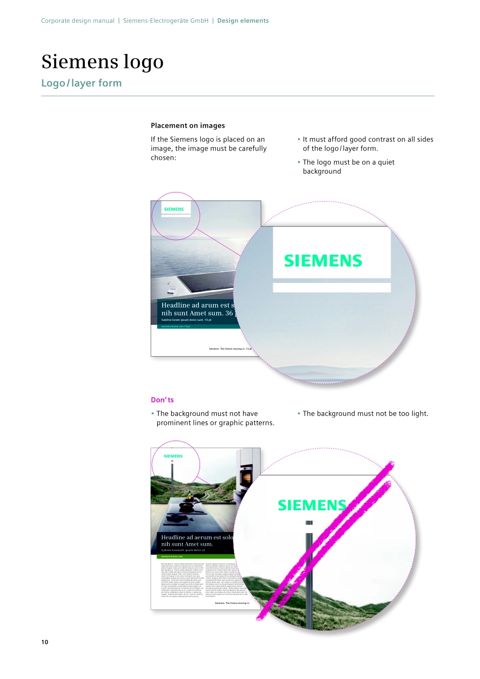
Working status of March 2012Siemens. The future moving in.Version 2.0The new corporate designManual for Siemens Home Appliances2Corporate design manual | Siemens-Electrogeräte GmbH | Table of contents2ContentCorporate design manual | Siemens-Electrogeräte GmbH | Table of contents3Preface (Work in progress) Brand concept (Work in progress) Design elementsThe new corporate design Siemens logo Colors Typography Illustrations & infographics Layout Format adaptations Advertisements & postersDesign basics Advertisements Advertorials Indoor posters Outdoor posters PoS materialsDesign basics Two-dimensional PoS materials Three-dimensional PoS materials Eye-catchersDesign basics Placement BrochuresDesign basics Cover design Inside pages Appliance feature tables Overview of formats Brochure examples Brochure structure 56 8 13 19 24 25 38 4142 44 54 56 62 7374 78 97 105106 116 127128 140 165 210 219 220 222Working status of March 2012The new corporate design | Version 1.0, October 2011Design elementsThe new corporate designSiemens logoColors Typography LayoutFormat adaptationsWorking status of October 2011The new corporate designComparison of old and newThe future moving in.Finally a washing machine that automatically measures and dispenses the detergent.The new Siemens Master Class with i-Dos.OldNewThe old corporate design was characterized by a hori zontal layer that contained the Siemens logo, tagline, body copy, and URL.The background image always filled the ad, with the headline positioned freely on top of it.The new corporate design offers more layout flexibility, to suit the “storytelling” campaign concept. Like the design elements, it is cross-media and can be adapted to other media without any problems.The logo and vertical layer form a closed unit – the logo / layer form. It is always at the top left of the ad and is used across all media.The flexible height of the image area is typical for the new layout. Running copy and the tagline are placed in the white space below it. The height of the white space depends on how much copy there is. Also important is the “Transparent Layer” which is prominently placed on the image area and white space. It consists of a large, slightly translucent area (“Big Bar”) and a small colored area (“Small Bar”). This gives the copy impact and good legibility. The “Big Bar” con-tains the headline and an optional subhead. The URL is always placed in the “Small Bar”.lum dolore eu feugiat nulla facil isis at vero eros et accumsan et iusto odio dignissim quibla ndit praesent luptatum zzril delenit augue duis do-lore te feugait nulla facilisi. Lorem ipsum dolor sit amet consecte tuer adipiscing elit sed diam nonummy nibh euismod tin cidunt ut laoreet dolore magna aliquam erat volutpatusm. Lorem ipsum dolor sit amet consectetuer adipiscing.siemens-home.comCooking can be so simple.The new built in ovens by Siemen...