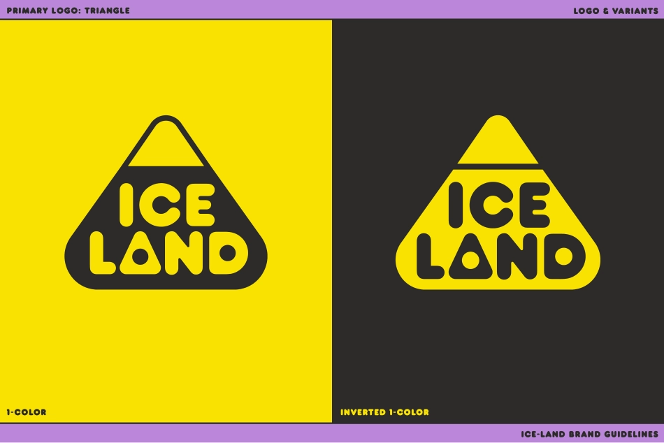
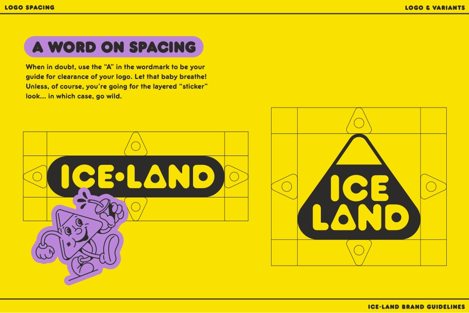
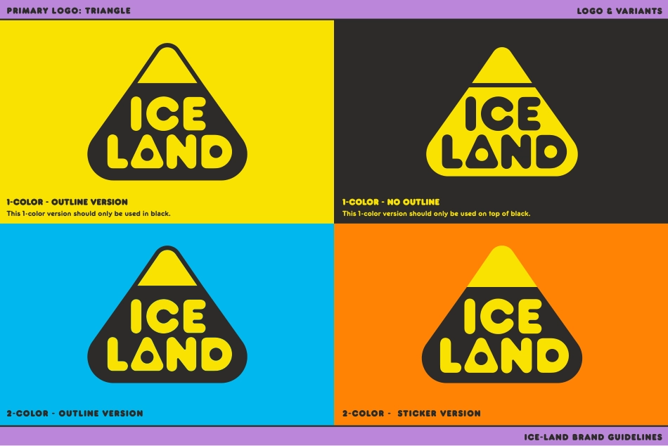
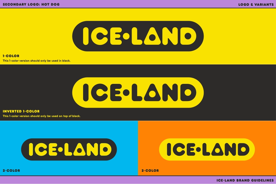
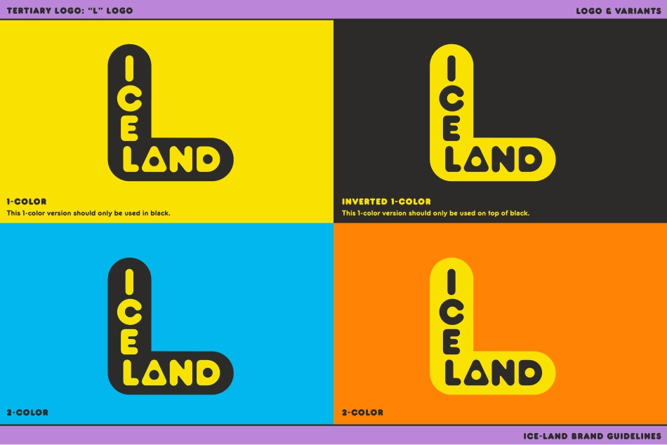
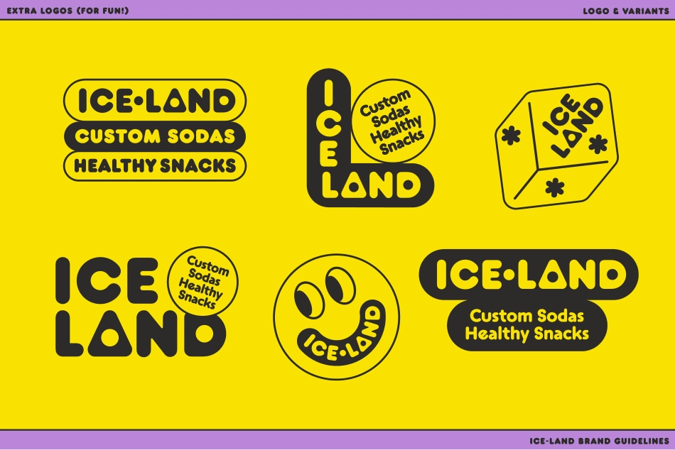
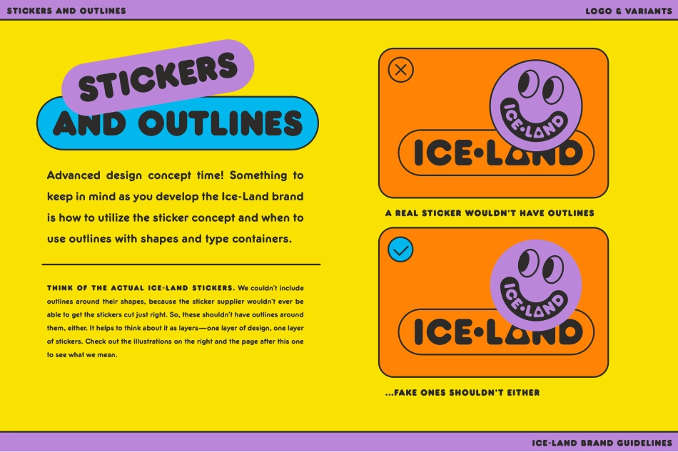
Brand GuidelinesTHE YOUNG JERKSMADE BY YOUR FRIENDS ATTable of Contentsu s a12345678Logos & VariantsType SystemColor SystemIllustration AssetsPackaging & PromoSocial AssetsLocation BrandingTONE & VOICELOGOSANDVARIANTS1-color Inverted 1-colorICE-LAND BRand guidelinesLOGO & VARIANTSPRIMARY Logo: TRIANGLEICE-LAND BRand guidelinesLOGO & VARIANTSWhen in doubt, use the “A” in the wordmark to be your guide for clearance of your logo. Let that baby breathe! Unless, of course, you’re going for the layered “sticker” look... in which case, go wild.LOGO SPACINGA WORD ON SPACING1-color - OUTLINE VERSIONThis 1-color version should only be used in black.1-color - no outlineThis 1-color version should only be used on top of black.2-color - OUTLINE VERSION2-color - STICKER VERSIONICE-LAND BRand guidelinesLOGO & VARIANTSPRIMARY Logo: TRIANGLE2-color2-colorInverted 1-colorThis 1-color version should only be used on top of black.1-color This 1-color version should only be used in black.ICE-LAND BRand guidelinesLOGO & VARIANTSSECONDARY Logo: HOT DOG1-color This 1-color version should only be used in black.Inverted 1-colorThis 1-color version should only be used on top of black.2-color2-colorICE-LAND BRand guidelinesLOGO & VARIANTSTERTIARY Logo: “L” LogoICE-LAND BRand guidelinesLOGO & VARIANTSEXTRA LOGOS (for fun!)ICE-LAND BRand guidelinesLOGO & VARIANTSSTICKERS AND OUTLINESAdvanced design concept time! Something to keep in mind as you develop the Ice-Land brand is how to utilize the sticker concept and when to use outlines with shapes and type containers. THINK OF THE actual ICE-LAND STICKERS. We couldn’t include outlines around their shapes, because the sticker supplier wouldn’t ever be able to get the stickers cut just right. So, these shouldn’t have outlines around them, either. It helps to think about it as layers—one layer of design, one layer of stickers. Check out the illustrations on the right and the page after this one to see what we mean.and OUTLINESSTICKERSA real sticker wouldn’t have outlines...FAKE ONES SHOULDN’T EITHERICE-LAND BRand guidelinesLOGO & VARIANTSOVERLAY LOGODon’t overlay 1-color versions on top of photos or patterns—use a solid color background, or use the 2-color version.USE BLACK!Use black for at least one color when designing.NO BLACK PEAKS!Don’t recolor the pyramid to have a black mountain top.DON’T MISUSE THIS 1-color VERSIONOnly use this one on top of black. Again, no black peaks!LOGO YUCKS & YUMSICE-LAND BRand guidelinesLOGO & VARIANTSSTICKERS AND OUTLINESTYPESYSTEMICE-LAND BRand guidelinesTYPE SYSTEMLONG LIVE THE DOGFRANKFURTER!FRANKFURTER!FRANKFURTER!FRANKFURTER!(BASED ON)FRANKFURTER!I’d rather be sodaOVER AT ICE-LAND!FRANKFURTERPart of the magic of Ice-Land’s type system is how it is so deceptively simple. The brand feels rich and custom, but also generically nostalgic at the same time. By primarily using Frankfurter for many different uses ...