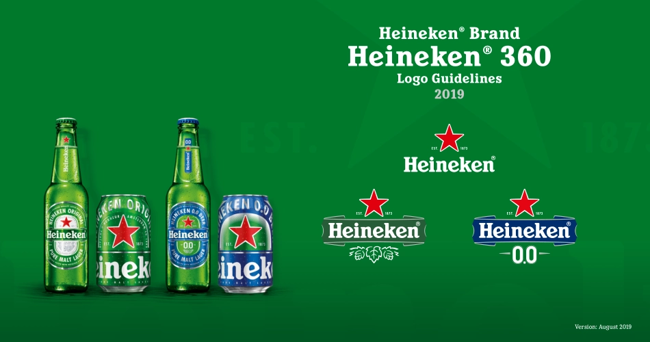
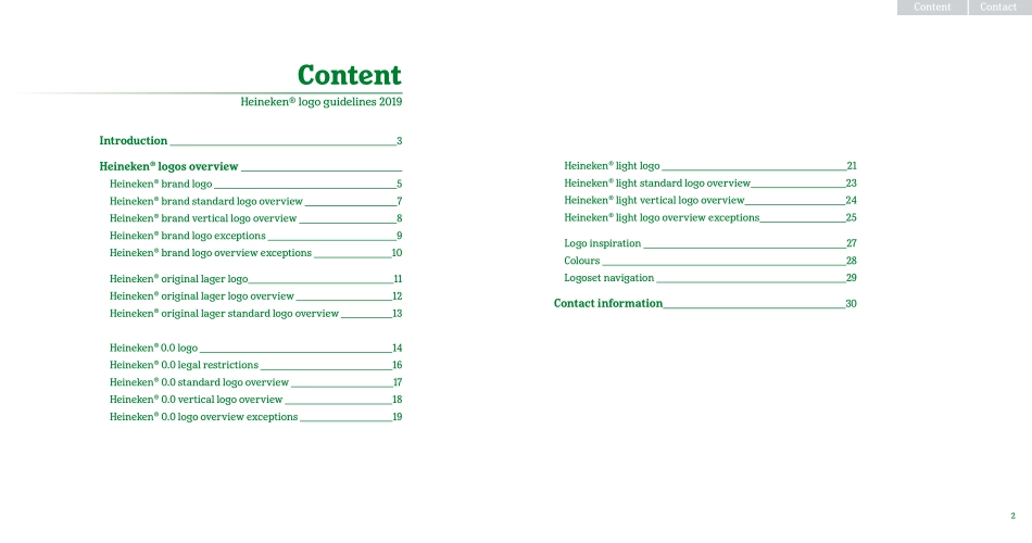
Heineken® BrandHeineken® 360Logo Guidelines2019Version: August 2019ContactContent2Heineken® light logo 21Heineken® light standard logo overview 23Heineken® light vertical logo overview 24Heineken® light logo overview exceptions 25Logo inspiration 27 Colours 28Logoset navigation 29Contact information 30ContentHeineken® logo guidelines 2019Introduction 3Heineken® logos overview Heineken® brand logo 5Heineken® brand standard logo overview 7Heineken® brand vertical logo overview 8Heineken® brand logo exceptions 9Heineken® brand logo overview exceptions 10Heineken® original lager logo 11Heineken® original lager logo overview 12Heineken® original lager standard logo overview 13Heineken® 0.0 logo 14Heineken® 0.0 legal restrictions 16Heineken® 0.0 standard logo overview 17Heineken® 0.0 vertical logo overview 18Heineken® 0.0 logo overview exceptions 19ContactContent3This guideline presents the next subtle step in the evolution of the Heineken® logos.It keeps the brand identity contemporary and progressive, makes Heineken’s most iconic design elements even more powerful, and subtly dials up the authentic roots.The visual brand identity is rooted in history, and in the iconic green bottle with race-track label.Let’s first zoom in on green.Around 1900 Gerard Adriaan Heineken wanted his premium quality beer to stand out from all the usual brown beer bottles. To express the clear, bright, fresh and natural character of his lager beer, he choose for a green bottle. Green became the iconic brand colour of Heineken®. And in this design evolution we use green even in the banner, which used to be black. Secondly the red star.The star is a medieval brewers symbol. 4 points represent the natural ingredients: malted barley, water,hops and Heineken’s unique A-Yeast. The 5th was the unknown magic of brewing. Today we don’t rely on magic anymore; we replaced it by craftsmanship. And we still keep the star as our core symbol. In the new logo- and label designs the star became again a bit more prominent. Showing the Heineken® quality symbol with more pride and confidence.And thirdly, we fine-tuned a lot of details: for example the drawing style of the hops, the outlines around the banner, the text EST. 1873 left and right of the star to show the birth-year of the brand, etc.The logos are of course derived from, and consistent with, the race-track label on our bottle and can.See the separate packaging design guidelines for more label details.It is of utmost importance that the Heineken® brand is always represented by the correct logos. It is one of the most valuable assets of our company, and world-famous, anchored in millions, or even billions, consumer minds. Always adhere to these guidelines, and in case of doubt, contact the Global Heineken® brand design team in Amsterdam.NOTE: Never use logo elements in isolation. For example: never use a smilin...