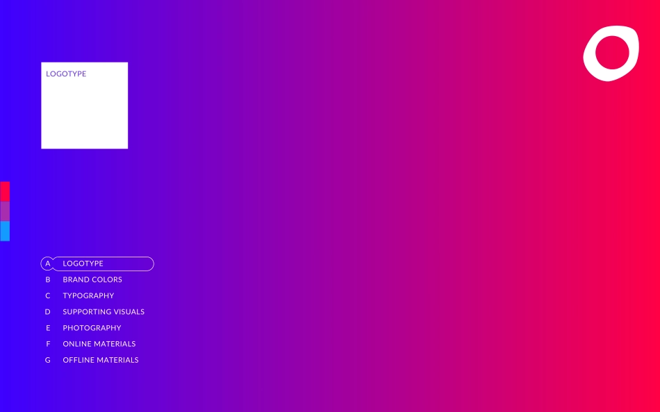
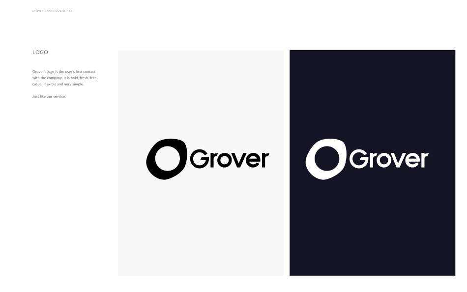
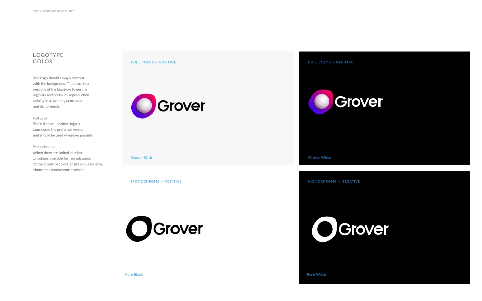
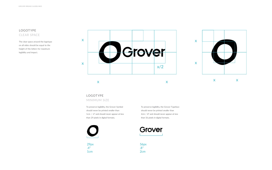
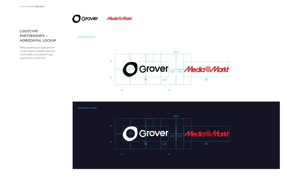
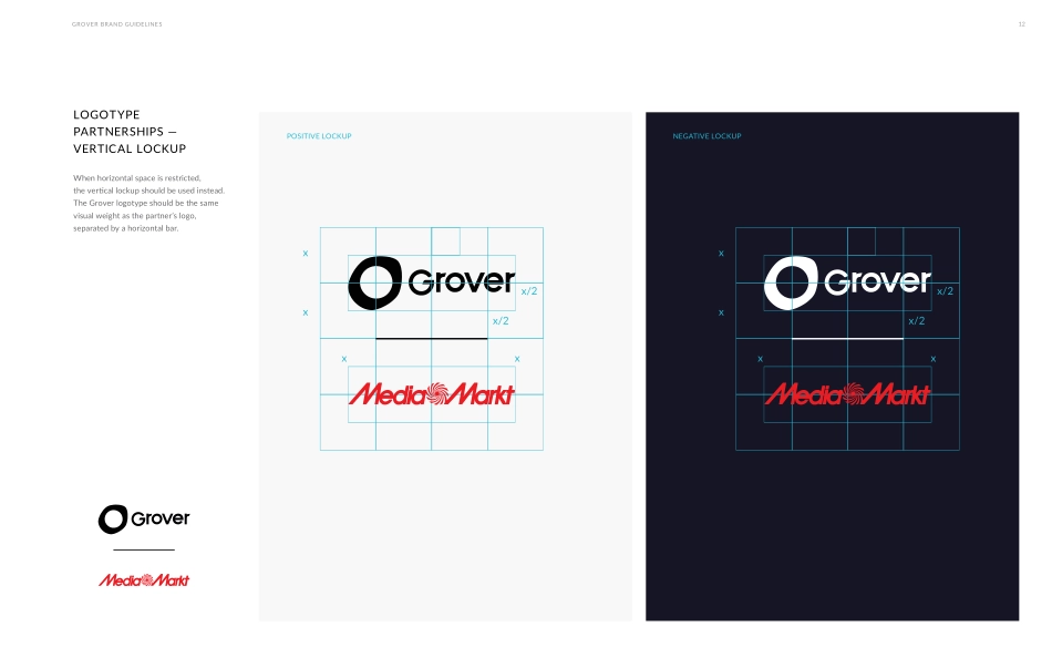
VISUALIDENTITYBOLD FUTURISTIC HUMAN TOUCHV060417 BERLINGROVER To boost everyone’s experience with the brand, follow our indications for the right use of our trademark.Do you want to look, feel and sound Grover? Stay true and keep reading. GROVER BRAND GUIDELINESWELCOME TO GROVER’S GUIDELINES GROVER BRAND GUIDELINESHISTORYLOGOTYPELOGOTYPEBRAND COLORSTYPOGRAPHYSUPPORTING VISUALSPHOTOGRAPHYONLINE MATERIALSOFFLINE MATERIALSABCDEFGGrover’s logo is the user’s first contact with the company. It is bold, fresh, free, casual, flexible and very simple. Just like our service.GROVER BRAND GUIDELINESLOGOGROVER BRAND GUIDELINESFULL COLOR — POSITIVEMONOCHROME — POSITIVEFULL COLOR — NEGATIVEMONOCHROME — NEGATIVEGrover BlackGrover WhitePure WhitePure BlackThe Logo should always contrastwith the background. There are four versions of the logotype to ensure legibility and optimum reproductionqulality in all printing processesand digital needs.Full color:The full color - positive logo isconsidered the preferred version,and should be used wherever possible.Monochrome:When there are limited numberof colours available for reprodcution, or the qulaity of colors or size is quesionable, choose the monochrome version. LOGOTYPECOLORGROVER BRAND GUIDELINESxxxx/2x56px.8’’2cm29px.4’’1cmLOGOTYPECLEAR SPACEThe clear space around the logotype on all sides should be equal to the height of the letters for maximum legibility and impact.LOGOTYPEMINIMUM SIZETo preserve legibility, the Grover Symbolshould never be printed smaller than 1cm / .4” and should never appear at less than 29 pixels in digital formats.To preserve legibility, the Grover Typefaceshould never be printed smaller than 2cm / .8” and should never appear at less than 56 pixels in digital formats.xxxxGROVER BRAND GUIDELINESNEGATIVE LOCKUPBlackxxx3x3xx/2x/2x/2xs.5sxxx2x2xBlackxxx3x3xx/2x/2x/2xLOGOTYPEPARTNERSHIPS —HORIZONTAL LOCKUPWhen combining our logotype withanother brand, it should be the samevisual weight as the partner’s logo,separated by a vertical bar.POSITIVE LOCKUPxxxx/2x/2xxxxx/2x/2xLOGOTYPEPARTNERSHIPS —VERTICAL LOCKUPWhen horizontal space is restricted,the vertical lockup should be used instead.The Grover logotype should be the samevisual weight as the partner’s logo,separated by a horizontal bar. GROVER BRAND GUIDELINES12POSITIVE LOCKUPNEGATIVE LOCKUPGROVER BRAND GUIDELINES7INCORRECTLOGOTYPEIMPROPER USESNo gradients or articial textures are added to the Typefacecolours inconsistentAt all time, we should keep when possible the logo as vector. SVGs are at anytime available on Grover.design The perspective should never be altered.Drop shadows are never added to the logotype.The amount of space between the characters is never altered.The direction of the symbol when used alone, should always be right up.The logotype cannot be altered orredrawn in any other way. Previousversions should never be used andthe logotype should not appear ina line or block o...