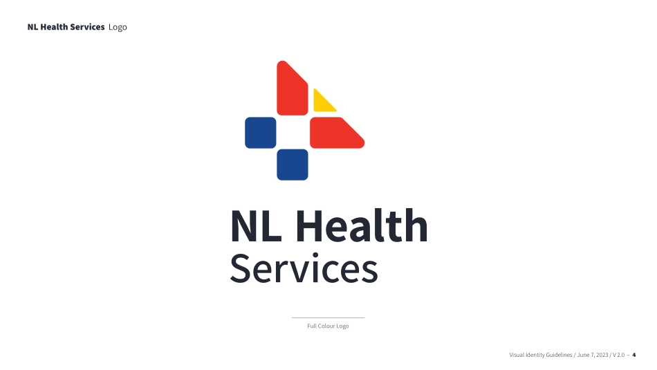
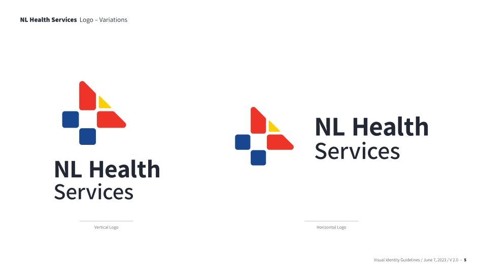
Visual Identity GuidelinesJune 7, 2023 / V 2.0Visual Identity Guidelines / June 7, 2023 / V 2.0 – 2Our Visual IdentityA visual identity is the sum of all visual impressions associated with a brand and the NL Health Services logo is a core element of that. The impact of any identity relies on consistent and repetitive use. This document serves to provide the framework for that consistency. Since it can be challenging to foresee all scenarios that may arise, we encourage you to get in touch should you have any questions about appropriate logo usage.communications@NLHealthServices.caVisual Identity Guidelines / June 7, 2023 / V 2.0 – 34 Logos14 Colours18 TypographyTable of ContentsVisual Identity Guidelines / June 7, 2023 / V 2.0 – 4NL Health Services LogoFull Colour LogoVisual Identity Guidelines / June 7, 2023 / V 2.0 – 5NL Health Services Logo – VariationsVertical LogoHorizontal LogoVisual Identity Guidelines / June 7, 2023 / V 2.0 – 6The segments of the symbol represent the coming together of the four regional health authorities, and the Newfoundland and Labrador Centre for Health Information.This unique palette reflects the colours of the provincial flag and establishes it as the provincial health authority. The colours are warm and optimistic, but grounded in deep tones to emphasize the seriousness of its purpose.The text is stacked so NL Health is more prominent.The strong provincial connection in the logo represents our commitment to patient care and a modern health-care system.“Health” is communicated by the health-care cross, which signifies our ongoing commitment to quality health care for the people of the province.A simplified map of the province is created by the two red points of the cross and the yellow triangle.The subtly rounded elements in the type mirror the symbol, which creates a balance and showcases the warmth of the people that make up NL Health Services.NL Health Services Logo – StoryVisual Identity Guidelines / June 7, 2023 / V 2.0 – 7NL Health Services Logo – One ColourIn certain cases, it may be necessary to use an all black version of theNL Health Services logo to ensure proper reproduction. This should only be used when the full colour or reverse logos are not an option.Vertical LogoHorizontal LogoVisual Identity Guidelines / June 7, 2023 / V 2.0 – 8Vertical LogoHorizontal LogoNL Health Services Logo – One ColourVisual Identity Guidelines / June 7, 2023 / V 2.0 – 8The reverse logo (in white) can be used on black, blue, or another brand colour that provides adequate contrast. Visual Identity Guidelines / June 7, 2023 / V 2.0 – 9NL Health Services Logo – RestrictionsIn keeping a clean, uncluttered look, a minimum free space should be maintained around the logo on all sides, at all times. Free space is equal to one of the red pieces of the icon. Visual Identity Guideline...