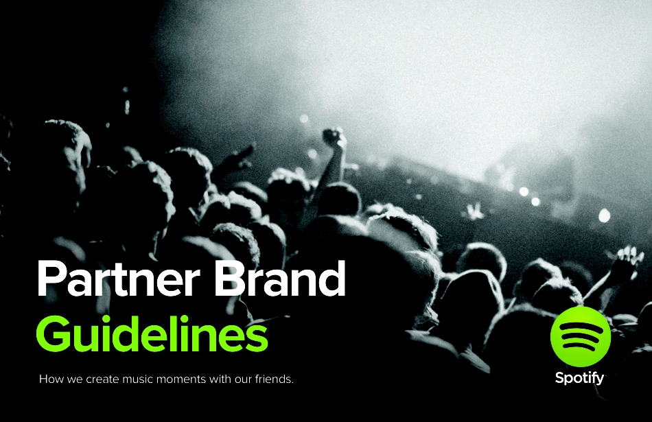
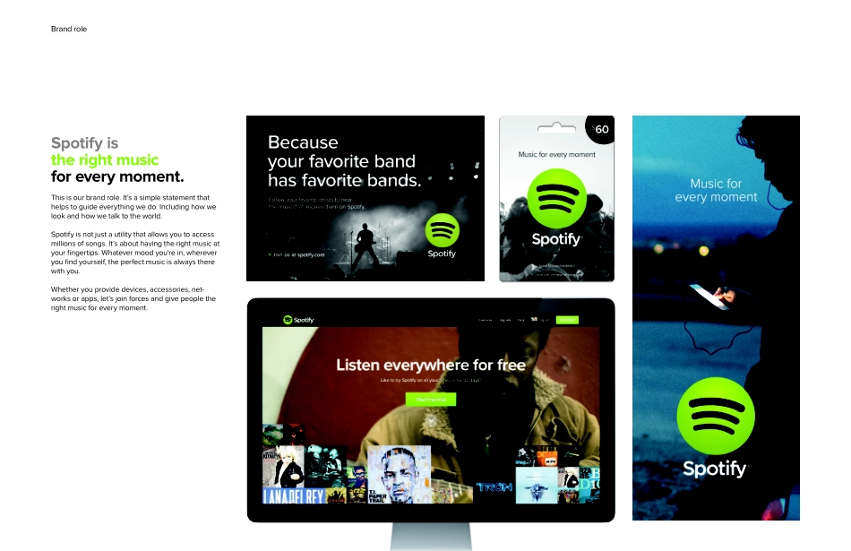
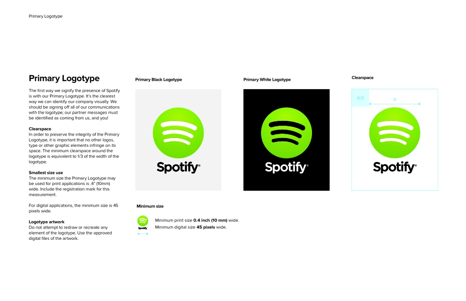
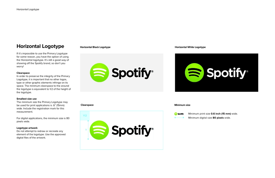
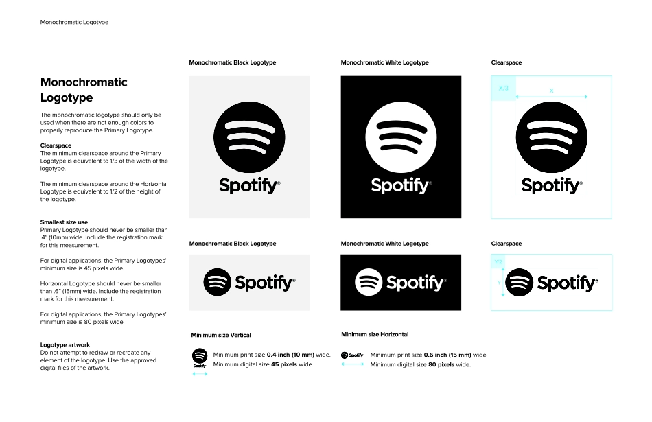
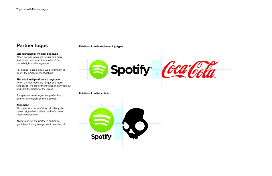
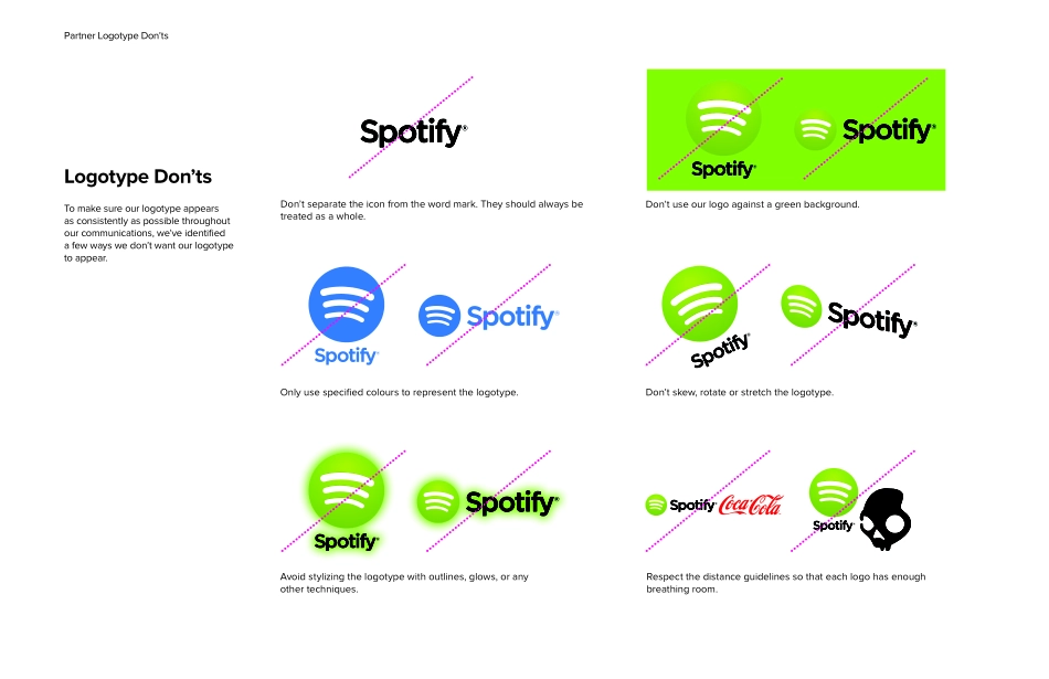
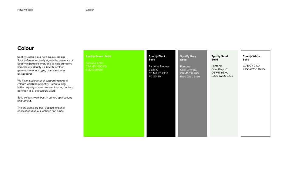
Partner Brand GuidelinesHow we create music moments with our friends.Brand roleSpotify isthe right musicfor every moment. This is our brand role. It’s a simple statement that helps to guide everything we do. Including how we look and how we talk to the world.Spotify is not just a utility that allows you to access millions of songs. It’s about having the right music at your fingertips. Whatever mood you’re in, wherever you find yourself, the perfect music is always there with you. Whether you provide devices, accessories, net-works or apps, let’s join forces and give people the right music for every moment.Primary Black LogotypeMinimum sizePrimary White LogotypeClearspaceMinimum sizeXX/3Minimum print size 0.4 inch (10 mm) wide.Minimum digital size 45 pixels wide.Primary LogotypeThe first way we signify the presence of Spotify is with our Primary Logotype. It’s the clearest way we can identify our company visually. We should be signing off all of our communications with the logotype; our partner messages must be identified as coming from us, and you!ClearspaceIn order to preserve the integrity of the Primary Logotype, it is important that no other logos, type or other graphic elements infringe on its space. The minimum clearspace around the logotype is equivalent to 1/3 of the width of the logotype.Smallest size useThe minimum size the Primary Logotype may be used for print applications is .4” (10mm) wide. Include the registration mark for this measurement. For digital applications, the minimum size is 45 pixels wide.Logotype artworkDo not attempt to redraw or recreate any element of the logotype. Use the approved digital files of the artwork.Primary LogotypeHorizontal LogotypeClearspaceHorizontal Black LogotypeHorizontal White LogotypeMinimum sizeMinimum print size 0.6 inch (15 mm) wide.Minimum digital size 80 pixels wide.YY/2Horizontal LogotypeIf it’s impossible to use the Primary Logotype for some reason, you have the option of using the Horizontal logotype. It’s still a good way of showing off the Spotify brand, so don’t you worry!ClearspaceIn order to preserve the integrity of the Primary Logotype, it is important that no other logos, type or other graphic elements infringe on its space. The minimum clearspace to the around the logotype is equivalent to 1/2 of the height of the logotype.Smallest size useThe minimum size the Primary Logotype may be used for print applications is .6” (15mm) wide. Include the registration mark for this measurement. For digital applications, the minimum size is 80 pixels wide.Logotype artworkDo not attempt to redraw or recreate any element of the logotype. Use the approved digital files of the artwork.Monochromatic LogotypeMonochromatic Black LogotypeMonochromatic White LogotypeClearspaceMinimum sizeMonochromatic Black LogotypeMonochromatic White LogotypeClearspaceXX/3YY/2Minimum size VerticalMinimum print siz...