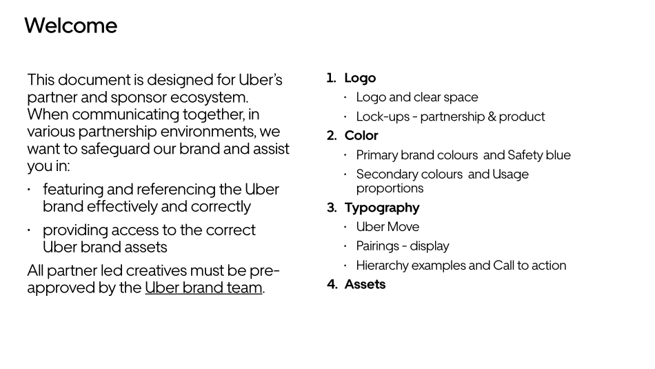
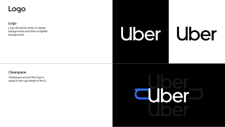
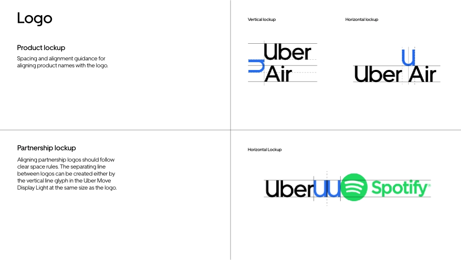
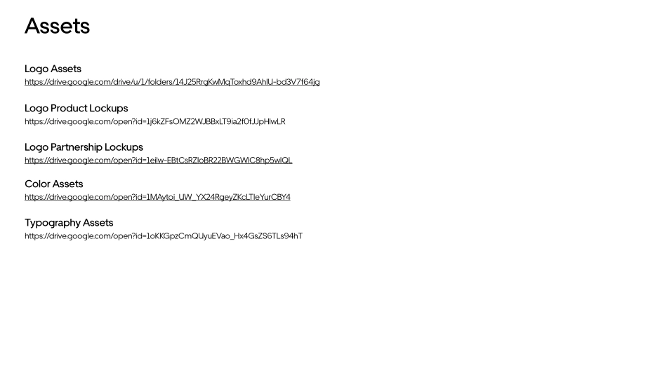
Brand system quick guideOctober 2018This document is designed for Uber’s partner and sponsor ecosystem. When communicating together, in various partnership environments, we want to safeguard our brand and assist you in: • featuring and referencing the Uber brand effectively and correctly • providing access to the correct Uber brand assets All partner led creatives must be pre-approved by the Uber brand team. 1. Logo • Logo and clear space • Lock-ups - partnership & product 2. Color • Primary brand colours and Safety blue • Secondary colours and Usage proportions 3. Typography • Uber Move • Pairings - display • Hierarchy examples and Call to action 4. AssetsWelcome Logo Logo Logo should be white on darker backgrounds and black on lighter backgrounds.Clearspace Clearspace around the logo is equal to the cap height of the U.Logo Product lockup Spacing and alignment guidance for aligning product names with the logo.Partnership lockup Aligning partnership logos should follow clear space rules. The separating line between logos can be created either by the vertical line glyph in the Uber Move Display Light at the same size as the logo.Vertical lockupHorizontal lockupHorizontal LockupColor Primary brand colors Our primary brand colors are white and black. They are used to provide accessibility, simplicity, and consistency throughout all brand communications.Safety Blue Safety blue is an important color that is unique to Uber and should be used sparingly for moments of support, assurance, and delight at moments of interaction between a user and the brand.RGB — 255 255 255 CMYK — 0 0 0 0 HEX — FFFFFF PMS — WhiteWhiteRGB — 0 0 0 CMYK — 70 35 40 100 HEX — 000000 PMS — Black 6 CBlackRGB — 39 110 241 CMYK — 84 54 0 0 HEX — 276EF1 PMS — 2174 CSafety BlueColor Secondary colors Our secondary colors pull from the colors of transportation. They should be used sparingly throughout illustration, photography, and product in order to maintain meaning and potency. The secondary colors are only used reasonably for illustrations and within product.Usage proportions It is important to follow the rules of these proportions when creating any brand communication in order to maintain brand consistency and remain accessible for all people. White plays a very important role in all brand communications and should provide balance with black. Safety Blue is only used for critical moments that warrant care between Uber and the user. Uber GreenRGB — 71 179 117 CMYK — 93 0 63 0 HEX — 47B275 PMS — 2416 CUber YellowRGB — 255 192 67 CMYK — 0 21 76 0 HEX — FFC043 PMS — 135 CUber RedRGB — 230 76 53 CMYK — 0 82 80 0 HEX — F25138 PMS — 7417 CUber BrownRGB — 153 100 77 CMYK — 13 56 61 32 HEX — 99644C PMS — 7525 CUber OrangeRGB — 255 125 73 CMYK — 79 59 0 0 HEX — FF7D49 PMS — 164 CUber PurpleRGB...