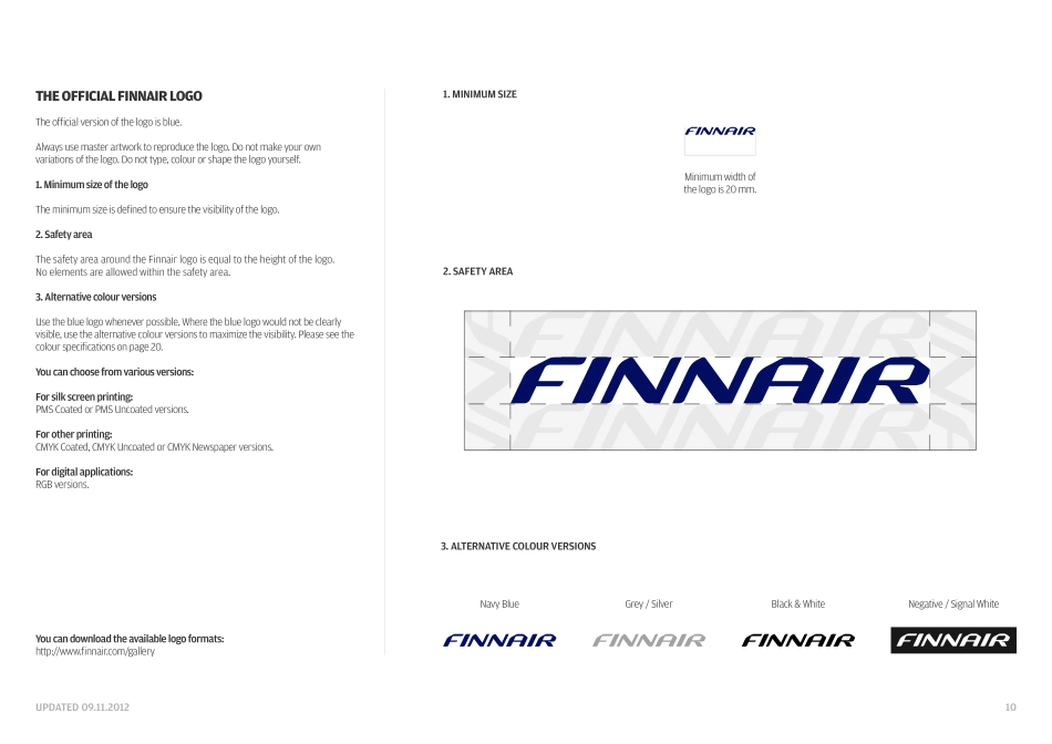
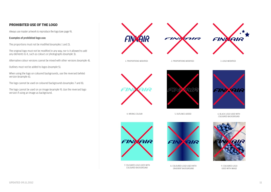
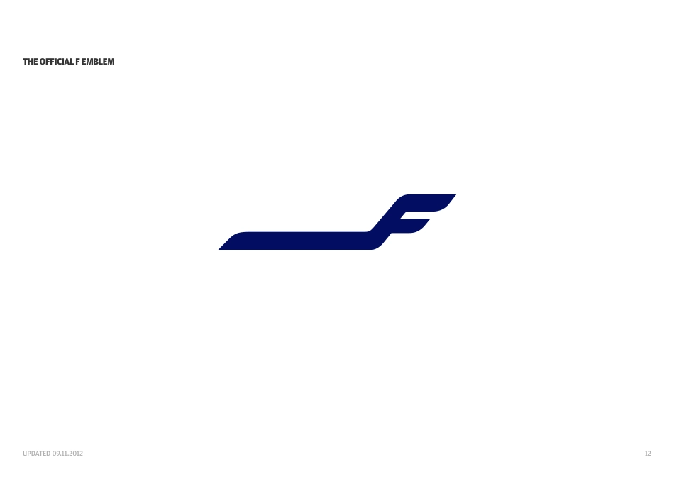
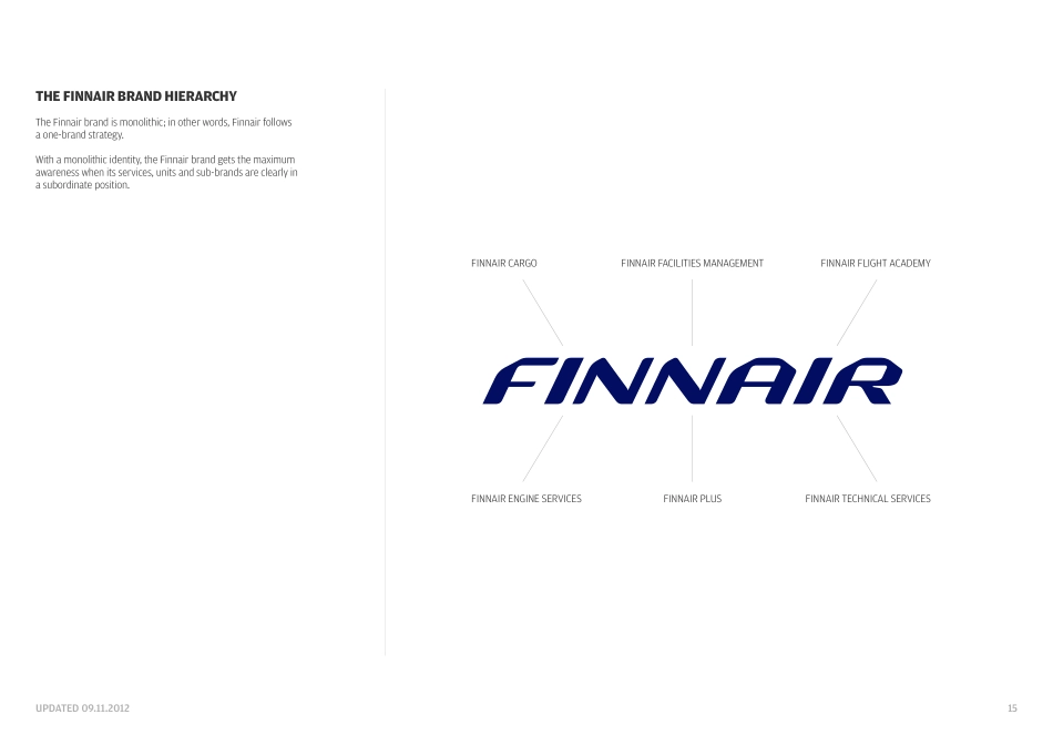
UPDATED 09.11.2012Graphics GuidelinesUPDATED 09.11.20128IndexTHE GRAPHICS GUIDELINESThe logo story The official Finnair logo Prohibited use of the logo The official F emblem The official F emblem versions Prohibited use of the F emblem The Finnair brand hierarchy Placement of a unit or sub-brand name near the Finnair logo as a guiding element Finnair Plus logo Finnair logo and oneworld logo Colours Using colours in layout/colour proportions Typography Use of typography 910111213141516171819202122UPDATED 09.11.20129THE OFFICIAL FINNAIR LOGOTHE LOGO STORYThe shapes of the Finnair logo represent functionalism and style which have always been essential parts of Finnair´s design. The logo embodies the smoothness of movement, like in air travel. On the side of a clean white aircraft, the dark blue logo communicates quality and dignity, bringing a touch of Nordic freshness to airports all over the world.UPDATED 09.11.201210THE OFFICIAL FINNAIR LOGOThe official version of the logo is blue. Always use master artwork to reproduce the logo. Do not make your own variations of the logo. Do not type, colour or shape the logo yourself. 1. Minimum size of the logoThe minimum size is defined to ensure the visibility of the logo.2. Safety areaThe safety area around the Finnair logo is equal to the height of the logo. No elements are allowed within the safety area.3. Alternative colour versionsUse the blue logo whenever possible. Where the blue logo would not be clearly visible, use the alternative colour versions to maximize the visibility. Please see the colour specifications on page 20.You can choose from various versions:For silk screen printing: PMS Coated or PMS Uncoated versions.For other printing: CMYK Coated, CMYK Uncoated or CMYK Newspaper versions.For digital applications: RGB versions.Minimum width of the logo is 20 mm.You can download the available logo formats: http://www.finnair.com/gallery3. ALTERNATIVE COLOUR VERSIONS1. MINIMUM SIZE2. SAFETY AREANavy BlueBlack & WhiteGrey / SilverNegative / Signal WhiteUPDATED 09.11.2012112. PROPORTIONS MODIFIED1. PROPORTIONS MODIFIEDPROHIBITED USE OF THE LOGOAlways use master artwork to reproduce the logo (see page 9).Examples of prohibited logo use:The proportions must not be modified (examples 1 and 2).The original logo must not be modified in any way, nor is it allowed to add any elements to it, such as colours or photographs (example 3).Alternative colour versions cannot be mixed with other versions (example 4).Outlines must not be added to logos (example 5).When using the logo on coloured backgrounds, use the reversed (white) version (example 6).The logo cannot be used on coloured backgrounds (examples 7 and 8).The logo cannot be used on an image (example 9). Use the reversed logo version if using an image as background.6. BLACK LOGO USED WITHCOLOURED BACKGROUND5. OUTLINES ADDED4. WRONG COLOUR8. COLOURED LOG...