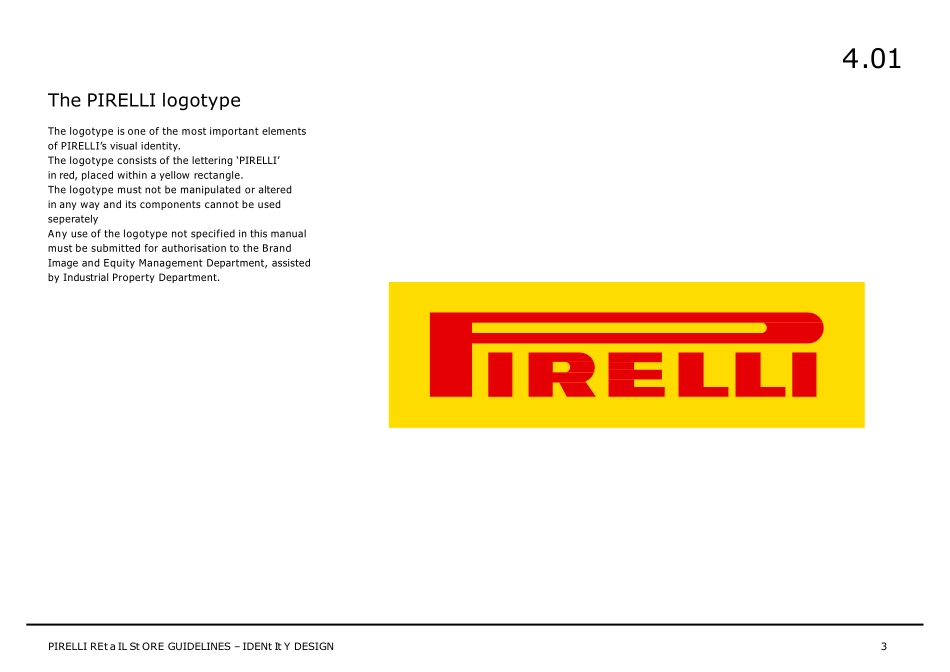
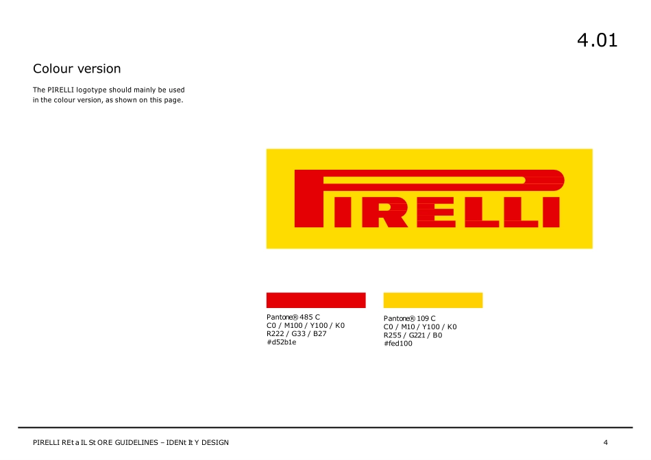
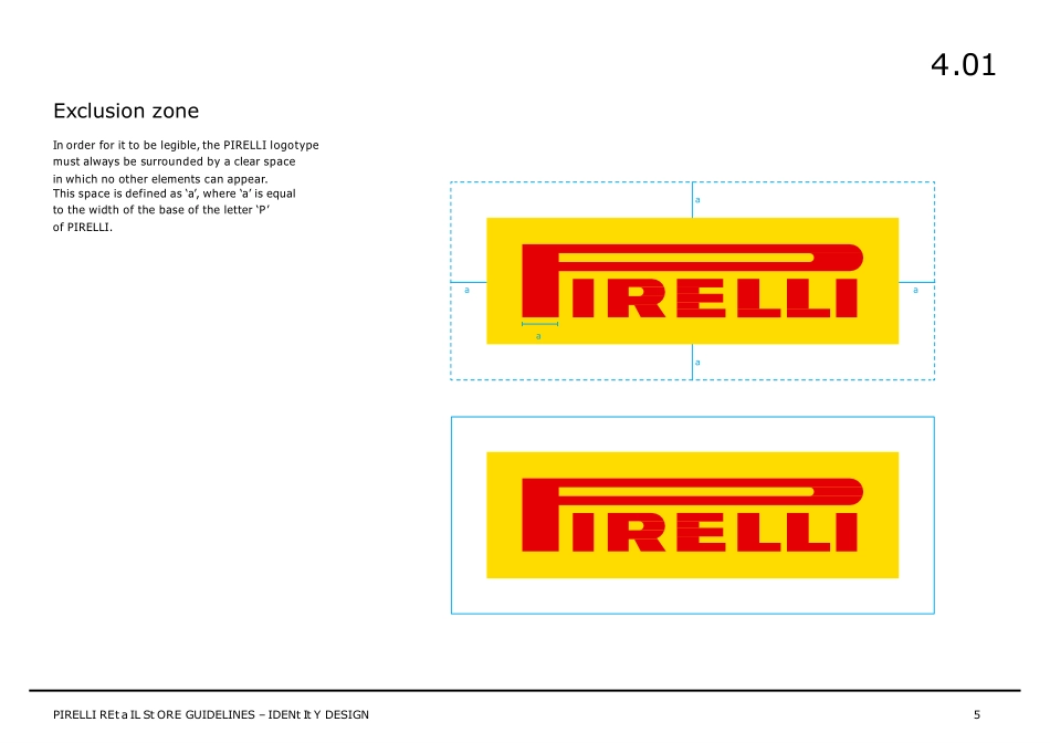
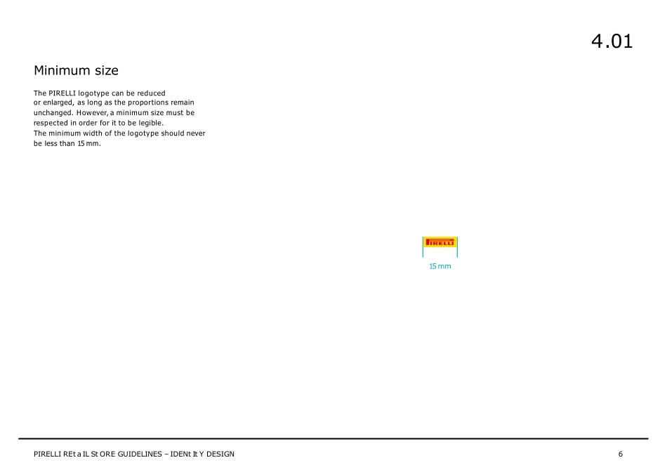
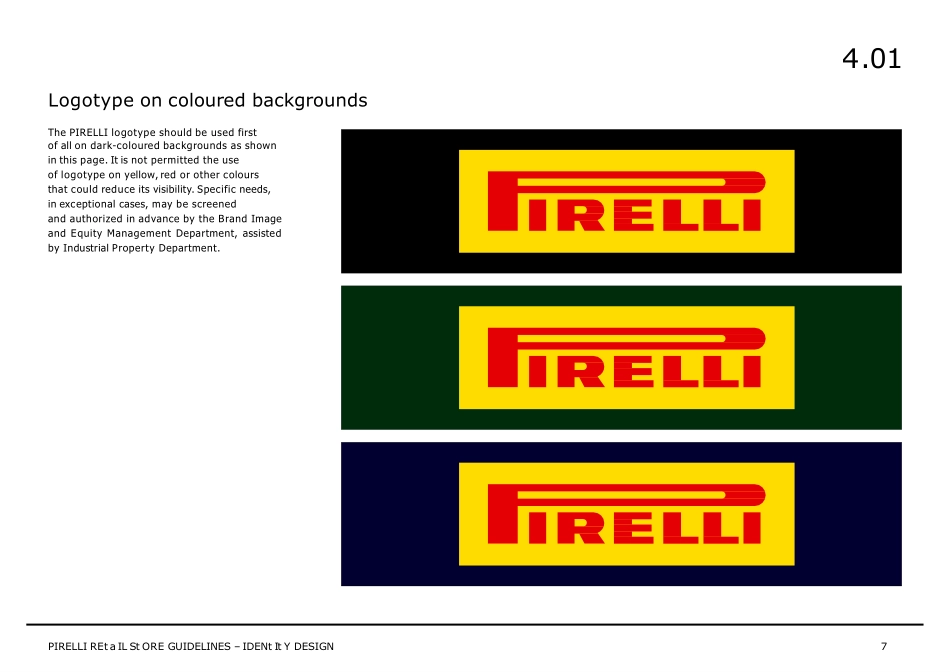
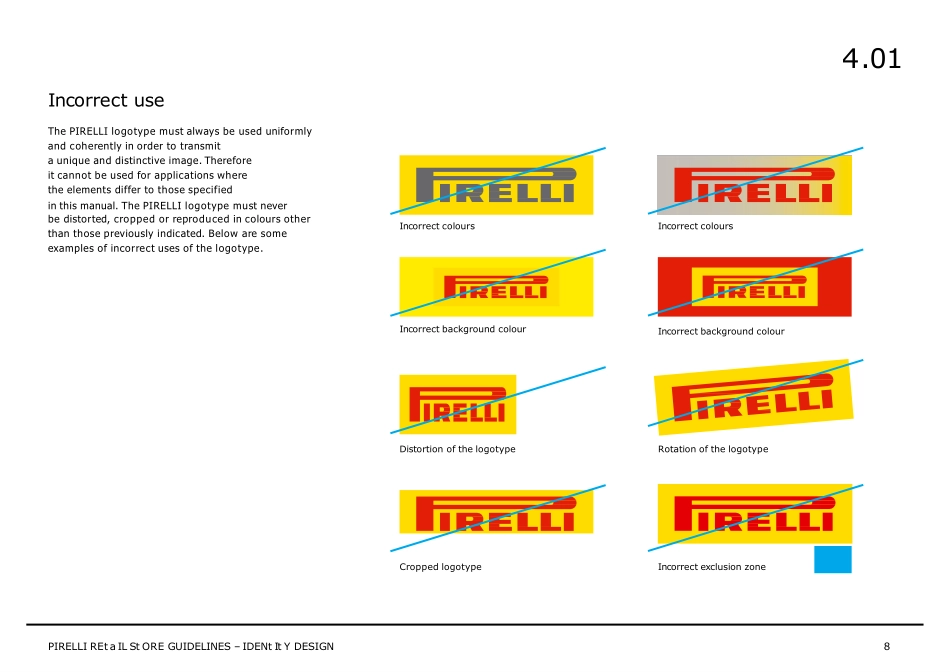
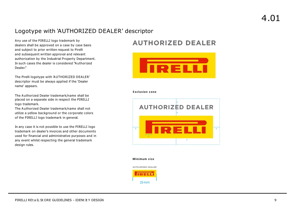
PIRELLI BRANDBOOK 4. IDENTITY DESIGN 4.01 LOGOTYPE 4.01 LOGOTYPE The PIRELLI logotype The logotype is one of the most important elements of PIRELLI’s visual identity. The logotype consists of the lettering ‘PIRELLI’ in red, placed within a yellow rectangle. The logotype must not be manipulated or altered in any way and its components cannot be used seperately Any use of the logotype not specified in this manual must be submitted for authorisation to the Brand Image and Equity Management Department, assisted by Industrial Property Department. 4.01 PIRELLI REt a IL St ORE GUIDELINES – IDENt It Y DESIGN 3 4.01 Colour version The PIRELLI logotype should mainly be used in the colour version, as shown on this page. Pantone® 485 C C0 / M100 / Y100 / K0 R222 / G33 / B27 #d52b1e PIRELLI REt a IL St ORE GUIDELINES – IDENt It Y DESIGN 4 Pantone® 109 C C0 / M10 / Y100 / K0 R255 / G221 / B0 #fed100 Exclusion zone In order for it to be legible, the PIRELLI logotype must always be surrounded by a clear space in which no other elements can appear. This space is defined as ‘a’, where ‘a’ is equal to the width of the base of the letter ‘P’ of PIRELLI. a a a a a 4.01 PIRELLI REt a IL St ORE GUIDELINES – IDENt It Y DESIGN 5 Minimum size The PIRELLI logotype can be reduced or enlarged, as long as the proportions remain unchanged. However, a minimum size must be respected in order for it to be legible. The minimum width of the logotype should never be less than 15 mm. 15 mm 4.01 PIRELLI REt a IL St ORE GUIDELINES – IDENt It Y DESIGN 6 The PIRELLI logotype should be used first of all on dark-coloured backgrounds as shown in this page. It is not permitted the use of logotype on yellow, red or other colours that could reduce its visibility. Specific needs, in exceptional cases, may be screened and authorized in advance by the Brand Image and Equity Management Department, assisted by Industrial Property Department. Logotype on coloured backgrounds 4.01 PIRELLI REt a IL St ORE GUIDELINES – IDENt It Y DESIGN 7 Incorrect use The PIRELLI logotype must always be used uniformly and coherently in order to transmit a unique and distinctive image. Therefore it cannot be used for applications where the elements differ to those specified in this manual. The PIRELLI logotype must never be distorted, cropped or reproduced in colours other than those previously indicated. Below are some examples of incorrect uses of the logotype. Incorrect colours Cropped logotype Distortion of the logotype Incorrect colours Incorrect background colour Incorrect background colour Incorrect exclusion zone Rotation of the logotype 4.01 PIRELLI REt a IL St ORE GUIDELINES – IDENt It Y DESIGN 8 placed on a separate side in respect the PIRELLI logo trademark. The A uthorized Dealer trademark/name shall not utilize a yellow backgrou...
