电脑桌面
添加运营动脉到电脑桌面
安装后可以在桌面快捷访问

gap_logo_guidelines会员免费

gap_logo_guidelines_第1页
1/20
gap_logo_guidelines_第2页
2/20
gap_logo_guidelines_第3页
3/20
gap_logo_guidelines_第4页
4/20
gap_logo_guidelines_第5页
5/20
gap_logo_guidelines_第6页
6/20
gap_logo_guidelines_第7页
7/20
gap_logo_guidelines_第8页
8/20
gap_logo_guidelines_第9页
9/20
gap_logo_guidelines_第10页
10/20
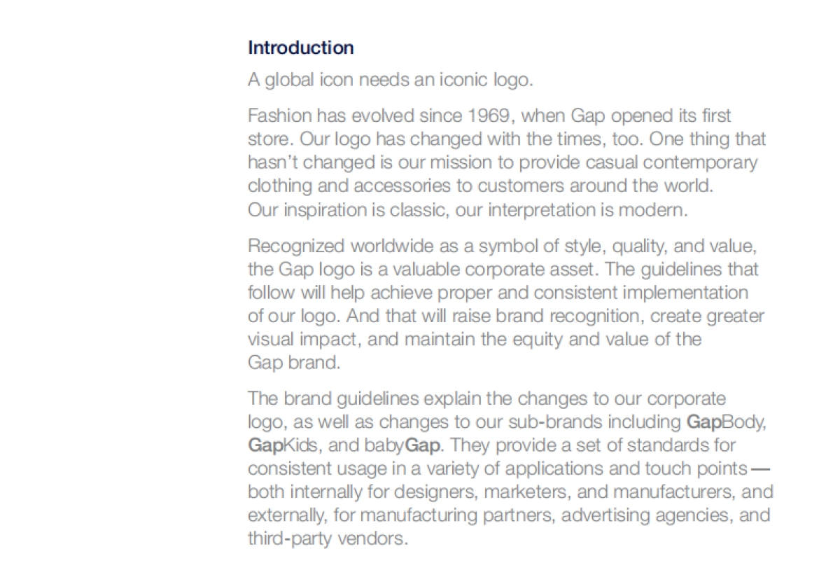
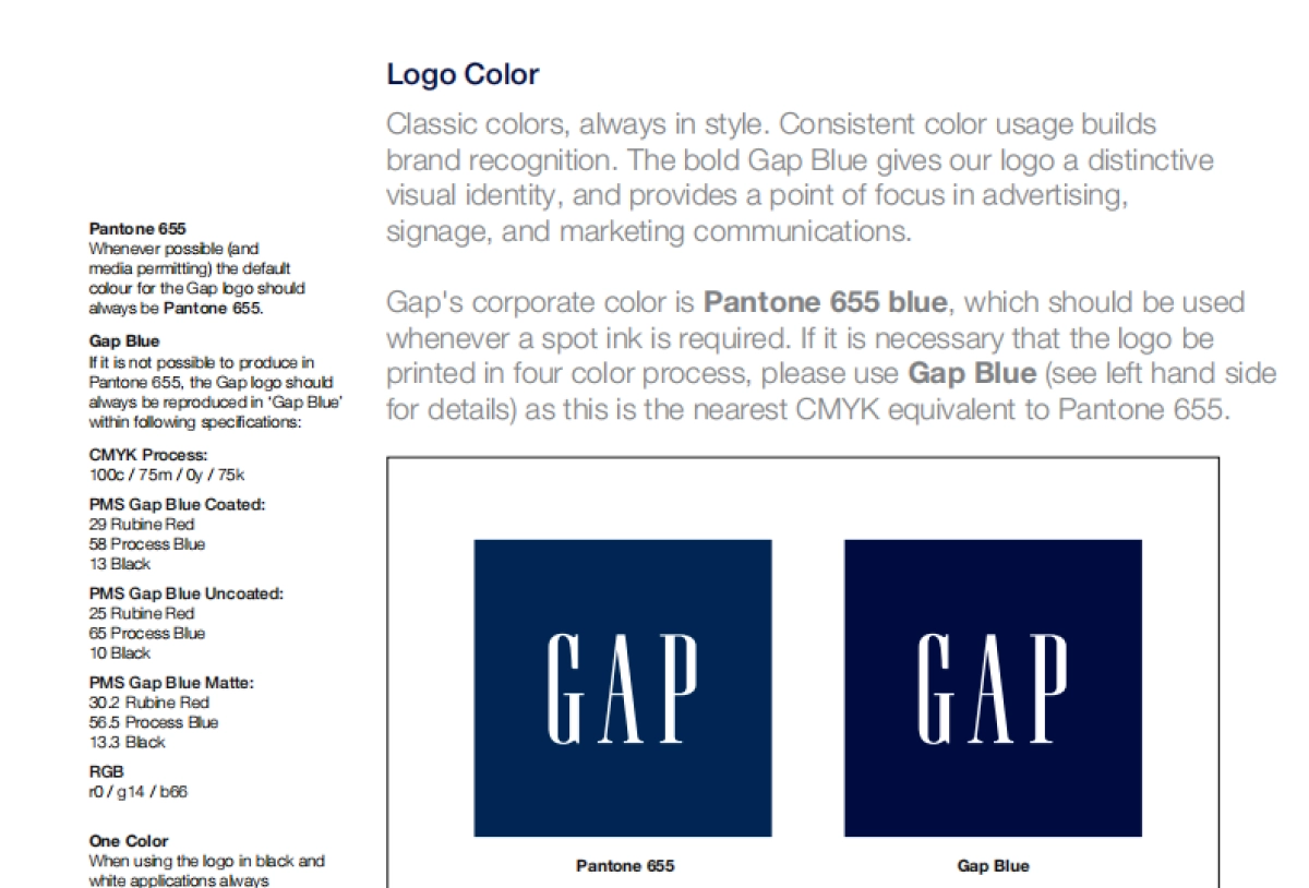
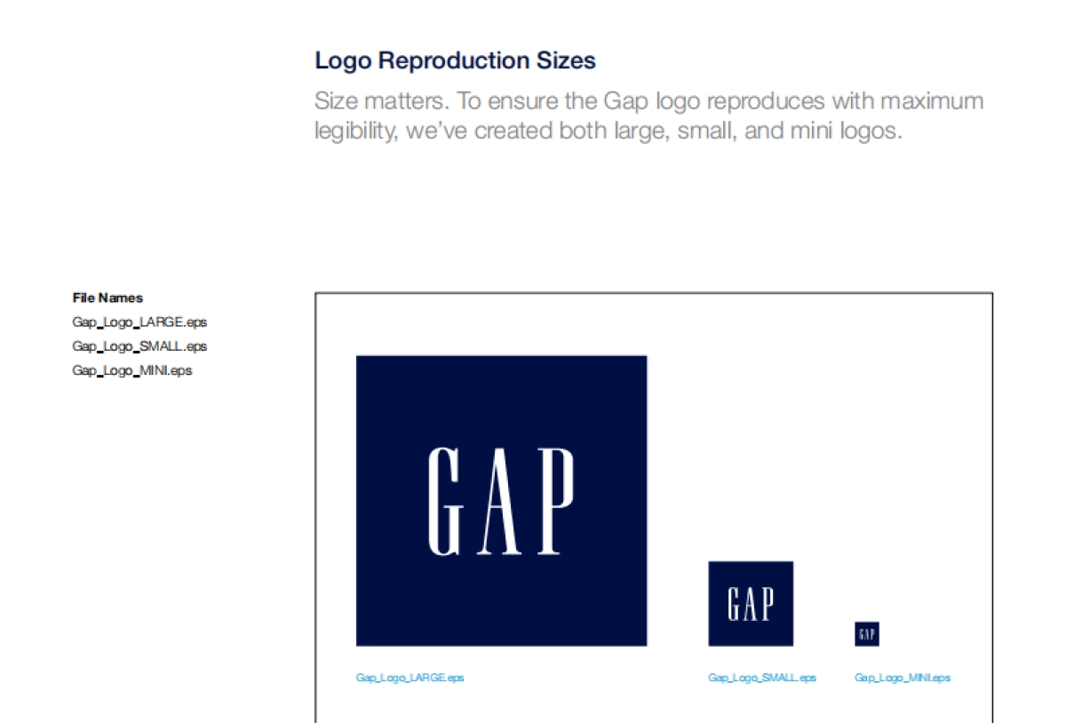
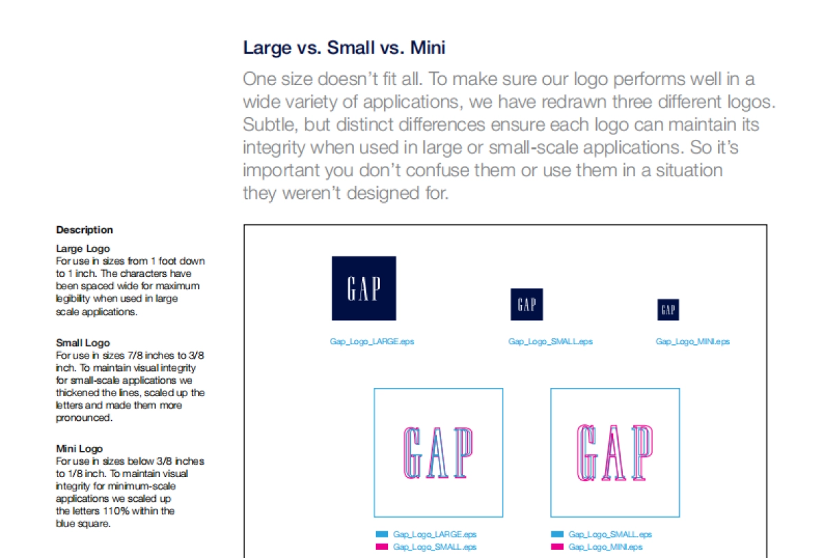
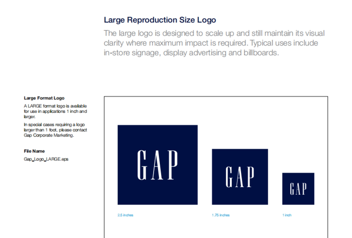
IntroductionA global icon needs an iconic logo. Fashion has evolved since 1969, when Gap opened its first store. Our logo has changed with the times, too. One thing that hasn’t changed is our mission to provide casual contemporary clothing and accessories to customers around the world. Our inspiration is classic, our interpretation is modern.Recognized worldwide as a symbol of style, quality, and value, the Gap logo is a valuable corporate asset. The guidelines that follow will help achieve proper and consistent implementation of our logo. And that will raise brand recognition, create greater visual impact, and maintain the equity and value of the Gap brand.The brand guidelines explain the changes to our corporate logo, as well as changes to our sub-brands including GapBody, GapKids, and babyGap. They provide a set of standards for consistent usage in a variety of applications and touch points —both internally for designers, marketers, and manufacturers, and externally, for manufacturing partners, advertising agencies, and third-party vendors.

Corporate Logo Evolution, not revolution. Our logo has changed with the times, while maintaining a respect for the Gap heritage. We’ve freshened it, cleaned up some of the typographic treatments, and made it easier to reproduce in a variety of formats. The result is a more modern design, contemporary, current, and immediately recognizable as Gap.DescriptionThree white uppercase letters on a blue background. A hallmark for simplicity. The new Gap logo has been scaled proportionally for legibility and reproducibility. The new logo is intended for use across all corporate communication, in-store and out of store.

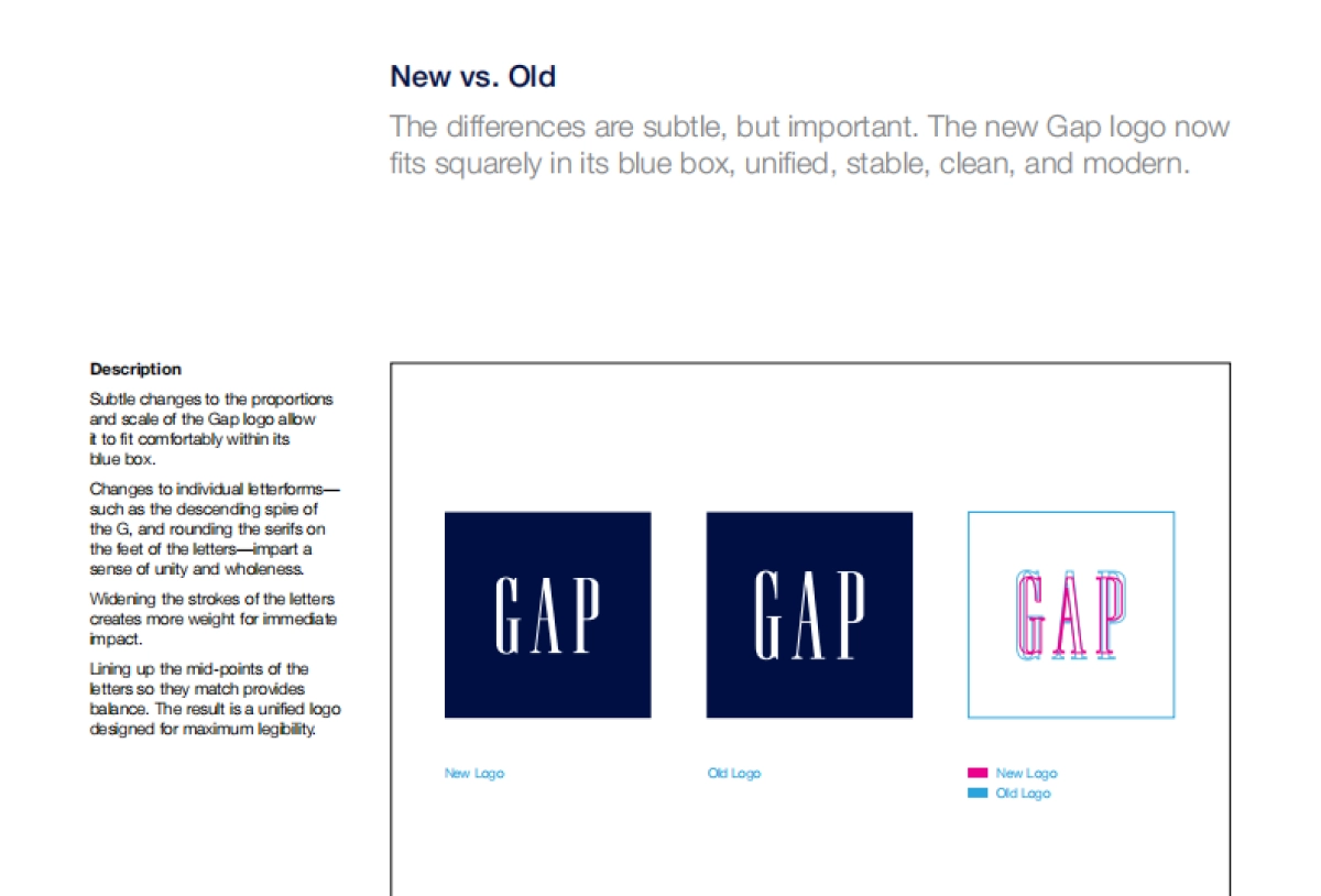
New vs. OldThe differences are subtle, but important. The new Gap logo now fits squarely in its blue box, unified, stable, clean, and modern.DescriptionSubtle changes to the proportions and scale of the Gap logo allow it to fit comfortably within its blue box. Changes to individual letterforms—such as the descending spire of the G, and rounding the serifs on the feet of the letters—impart a sense of unity and wholeness.Widening the strokes of the letters creates more weight for immediate impact. Lining up the mid-points of the letters so they match provides balance. The result is a unified logo designed for maximum legibility.New LogoOld LogoNew LogoOld Logo

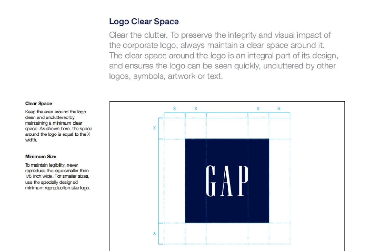
Logo Clear SpaceClear the clutter. To preserve the integrity and visual impact of the corporate logo, always maintain a clear space around it. The clear space around the logo is an integral part of its design, and ensures the logo can be seen quickly, uncluttered by other logos, symbols, artwork or text.Clear SpaceKeep the area around the logo clean and uncluttered by maintaining a minimum clear space. As shown here, the space around the logo is equal to the X width.Minimum SizeTo maintain legibility, never reproduce the logo...

1、当您付费下载文档后,您只拥有了使用权限,并不意味着购买了版权,文档只能用于自身使用,不得用于其他商业用途(如 [转卖]进行直接盈利或[编辑后售卖]进行间接盈利)。
2、本站所有内容均由合作方或网友上传,本站不对文档的完整性、权威性及其观点立场正确性做任何保证或承诺!文档内容仅供研究参考,付费前请自行鉴别。
3、如文档内容存在违规,或者侵犯商业秘密、侵犯著作权等,请点击“违规举报”。

查找下载文件的指引

一、电脑端

- Windows 系统:按下键盘快捷键 `Ctrl + J`,即可打开下载列表。  

- Mac 系统:按下键盘快捷键 `⌘ + J`,即可打开下载列表。  

二、手机端

1. 打开手机浏览器,点击浏览器右下角的 “≡”(或“更多”)图标。  

2. 在弹出的菜单中找到并点击 “下载内容”(或类似选项),即可查看已下载的文件。  

提示:不同浏览器界面略有差异,若未找到“下载”入口,可尝试在浏览器设置中搜索“下载”关键词。


gap_logo_guidelines

确认删除?
会员
教程
收藏
足迹
联系
  • 站长微信
回到顶部